Mithril: A suite of tools to drive growth in Web 3 communities
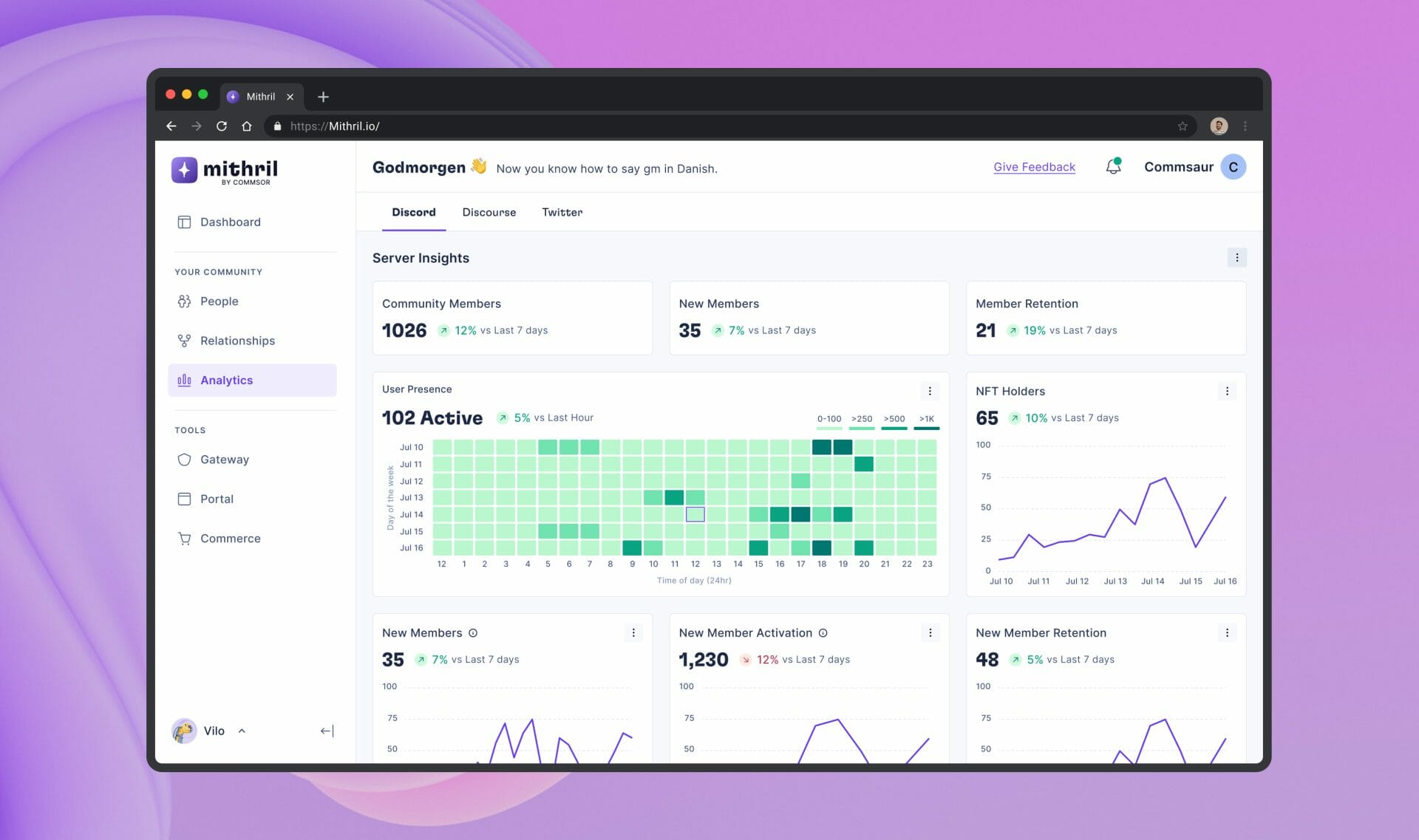
A lot of Web 3 products are built upon communities usually hosted on Discord. This ranges from NFT projects all the way to DEFI projects. Community managers struggle with finding that one tool that can provide valuable insights. For this reason, Commsor acquired Altr and renamed it Mithril. Mithril fills this gap by providing a complete suite of tools and deep analytics to give community managers everything they need.
Core Users
Mithril offers solutions for communities with over 100 members that have grown past their initial stages. These larger communities have unique needs and challenges that standard toolsets often overlook.
Problems
Altr, before it's acquisition, faced a few challenges. The user interface was outdated and clunky, and the user experience could be better. Additionally, the product's features needed to be expanded to better meet it’s target audience's needs.
Objectives
Given these issues, my role was to refine the UI, better enhance the UX, expand the product feature set, and create a design system to ensure consistency in the product suite. Guiding these improvements is the design principle “Keep it Simple Stupid” (KISS).
Opportunity
The success of this project meant Mithril could reach new user bases with increased utility, potentially increasing Commsor’s revenue.
ROLE
Lead Designer ( UX Evaluation, UI/UX Design, Prototyping)
team
Cole Zerr - Product Manager
Erik Rosemberg - Lead Engineer
Will Depue - Engineer
Dexter Molina - Engineer
Santi Arredondo- Engineer
Naren Gaurav - Community & BD
Making metrics better for users: What we did after talking to them
As a result of our interviews with current users, here is a list of issues we noted.
- A clucky and outdated UI
- The navigation was cluttered
- Graphs and chats were difficult to read and interpret
- Inconsistency in components and design elements
Solutions
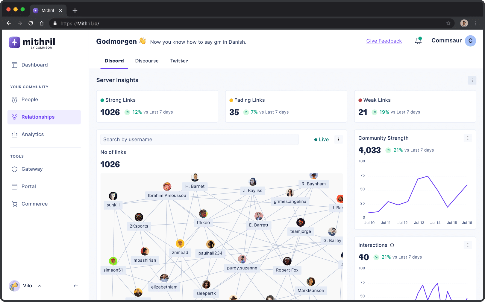
In the redesign, we stripped the navigation of pages we didn’t need. Took away features that were coming soon. Also, to clean up the dashboard, some metrics that were not used were taken off, and I designed a better layout for the information and charts.
Before
After
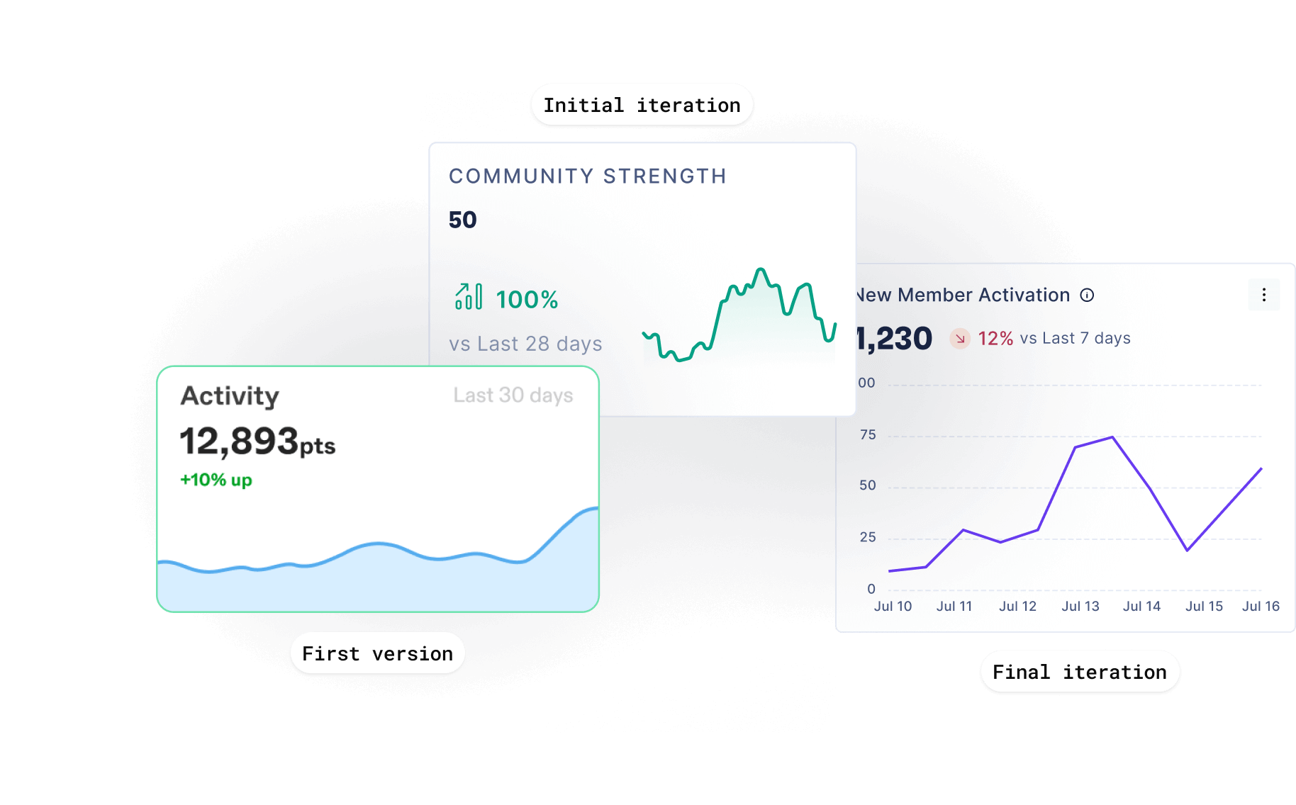
Also, we switched to a new line graph design that made it easy to see a trend at a glance and gave precise information over time.
Relationship analysis: Seeing how people connect
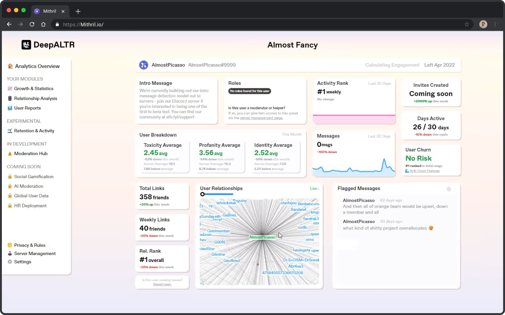
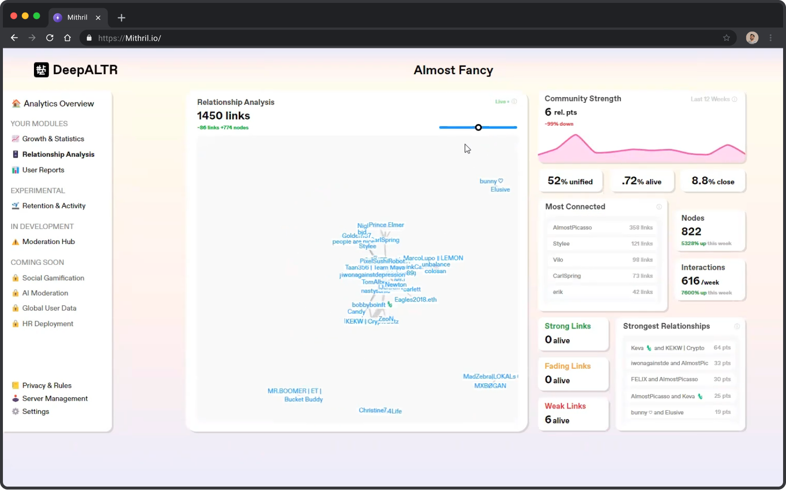
This chart shows the interconnectedness between community members. An increase in the number of links indicates community growth and activity.
Some of the changes made to this chart included the addition of basic information when you hover your mouse over a community member. Unlike the first version, we used visual clues to show selected members. Also, we used color to show which links were strong, weak, or disappearing.
Before

After
To reduce information density, we made it possible to isolate selected member connections from the mix. This change increased the ease of scanning by 70%.
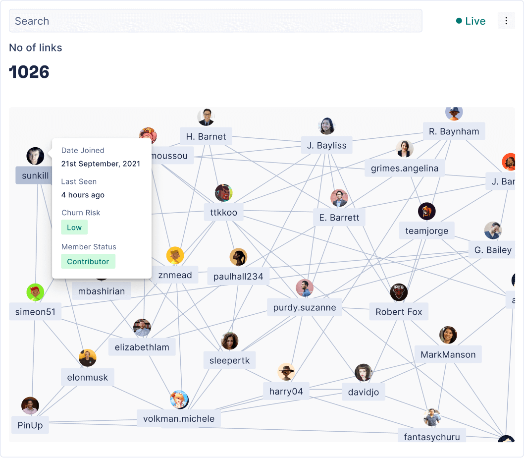
Community member information on hover
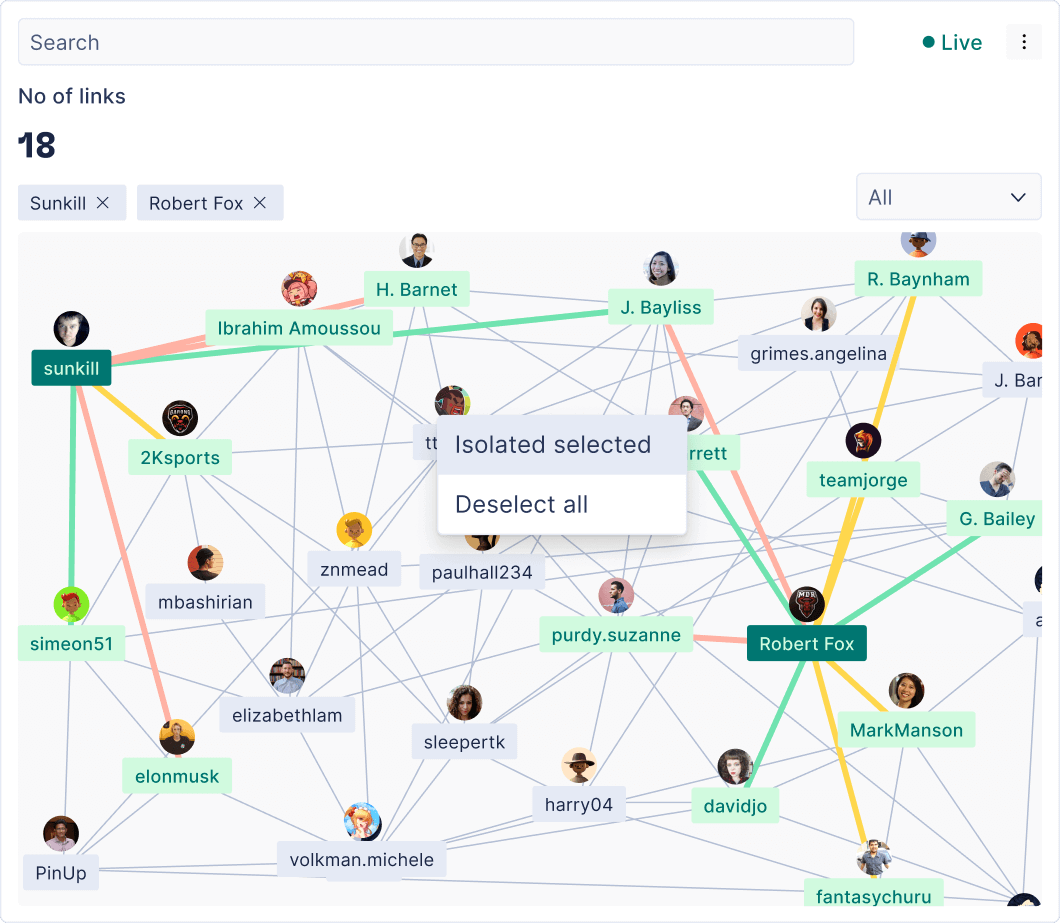
Option to isolate connections
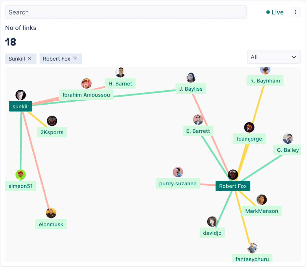
Selected members isolated from the mix
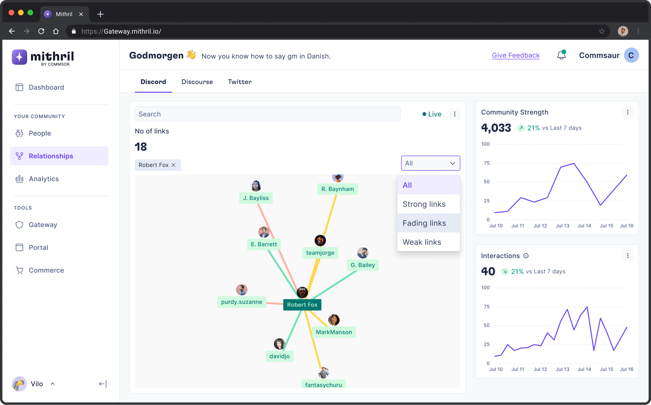
Chart showing strong, weak and fading links to Robert fox
Expanding Mithril's features ↴
Mithril Gateway: How communities give special roles and access
Token gating is a process where community admins give members roles, perks, and special access based on certain conditions, which are usually a set number or type of NFT.
Mithril Gateway gave communities a way to set up token-gated roles in a simple two-step process.
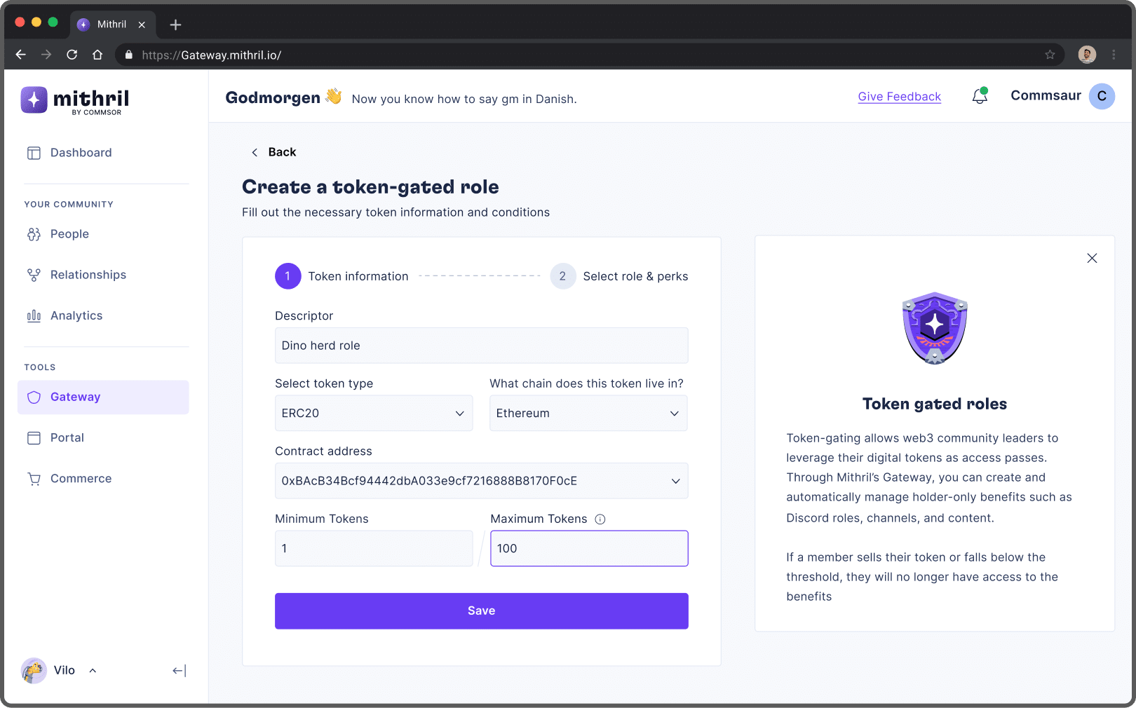
Creating a token-gated role: Adding token information
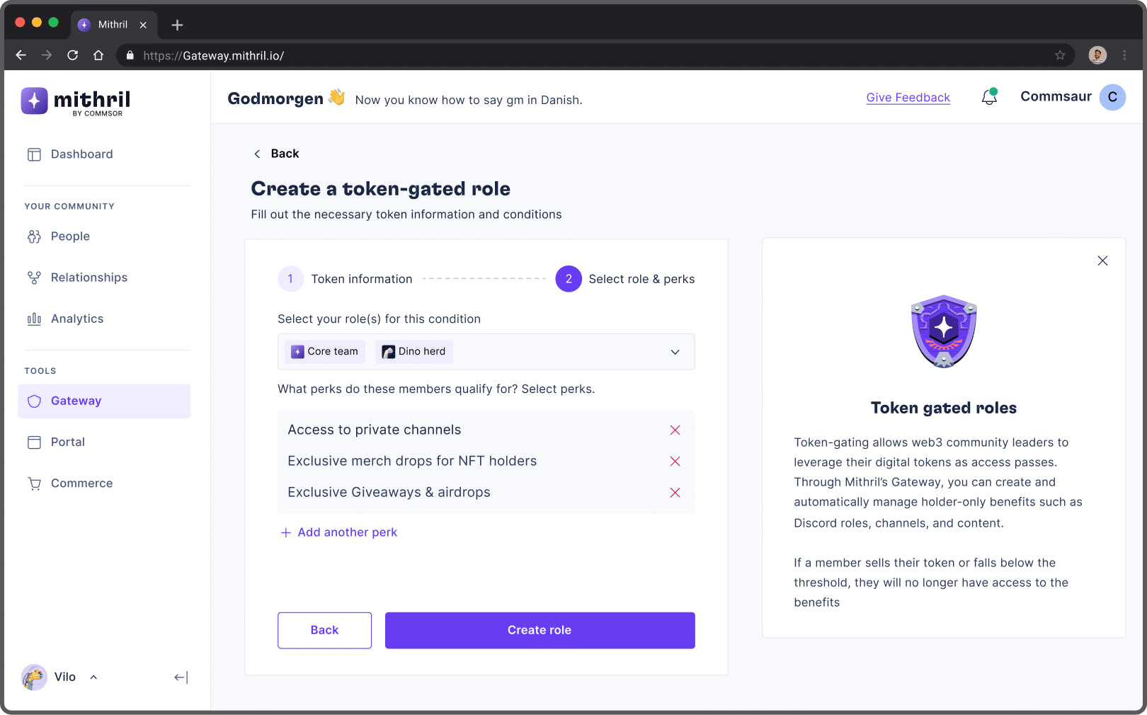
Creating a token-gated role: Selecting roles and perks
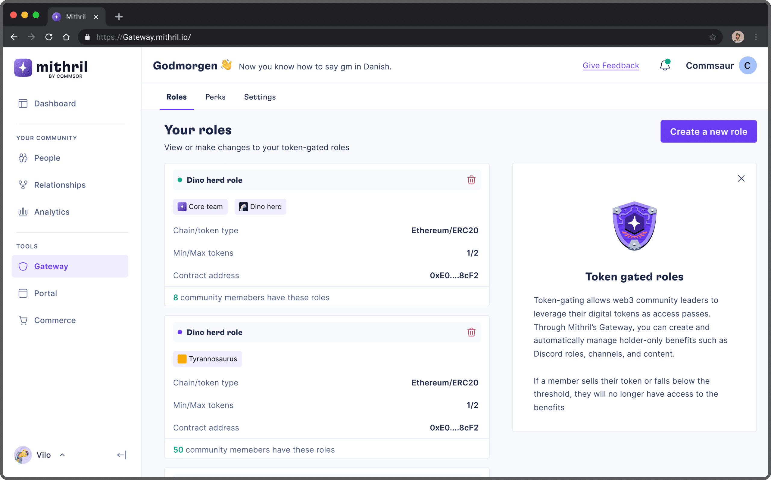
Page showing created roles
Community information and user stats
Members of a community could use their wallet address to log in to Mithril. This shows a list of communities they belong to with the Mithril bot integrated.
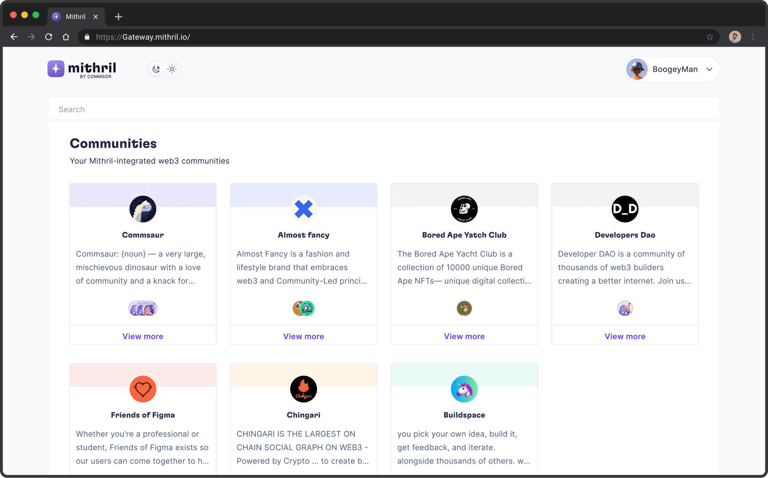
Page showing your communities that integrated the Mithril bot
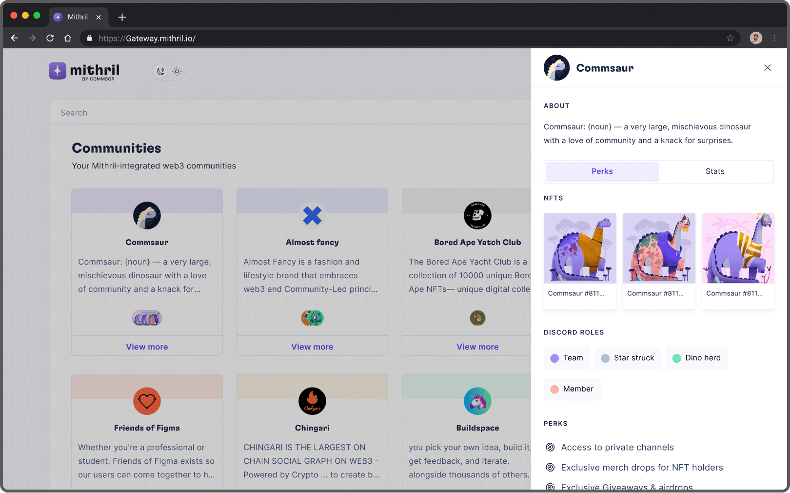
Side bar showing your NFT's, your roles and perks
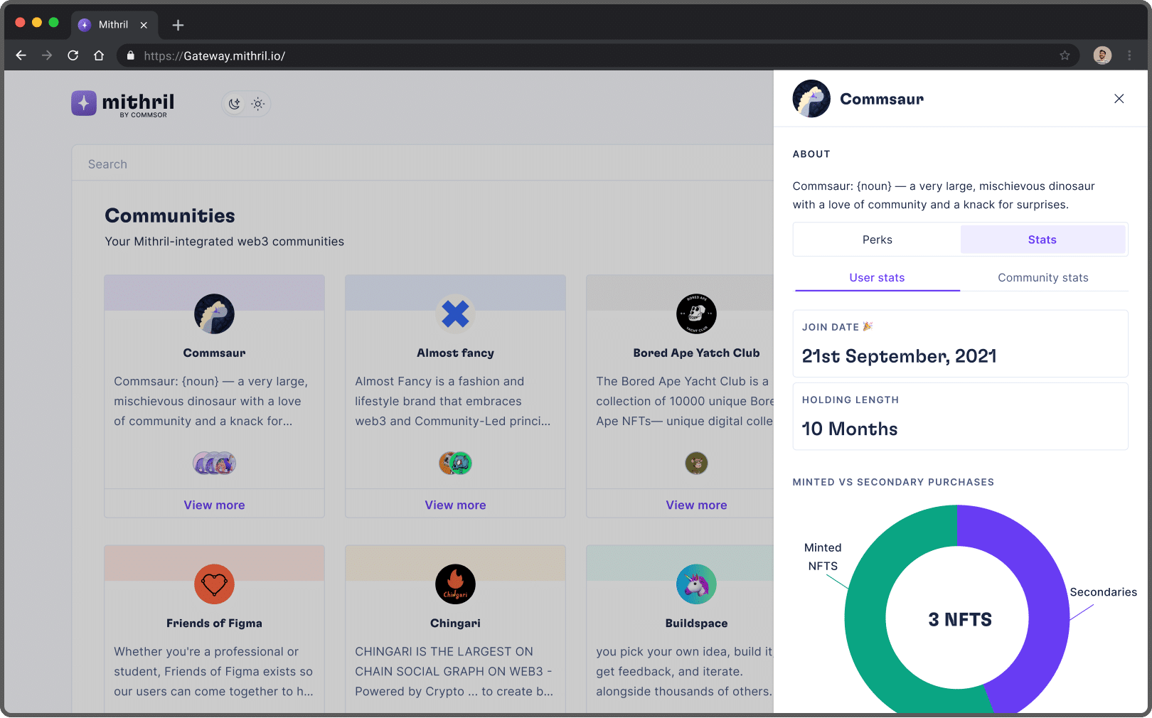
Side bar showing some user data
Mithril Portal: The Homepage for your Web 3 community
While there are many link aggregators available, most of them don't serve the needs of Web 3 communities. This is the problem Portal set out to solve. It allows basic links and socials, but it also lets you connect NFT platforms like Opensea, Lookrare, and Snapshot for DAO proposals.
Mithril's user-facing page
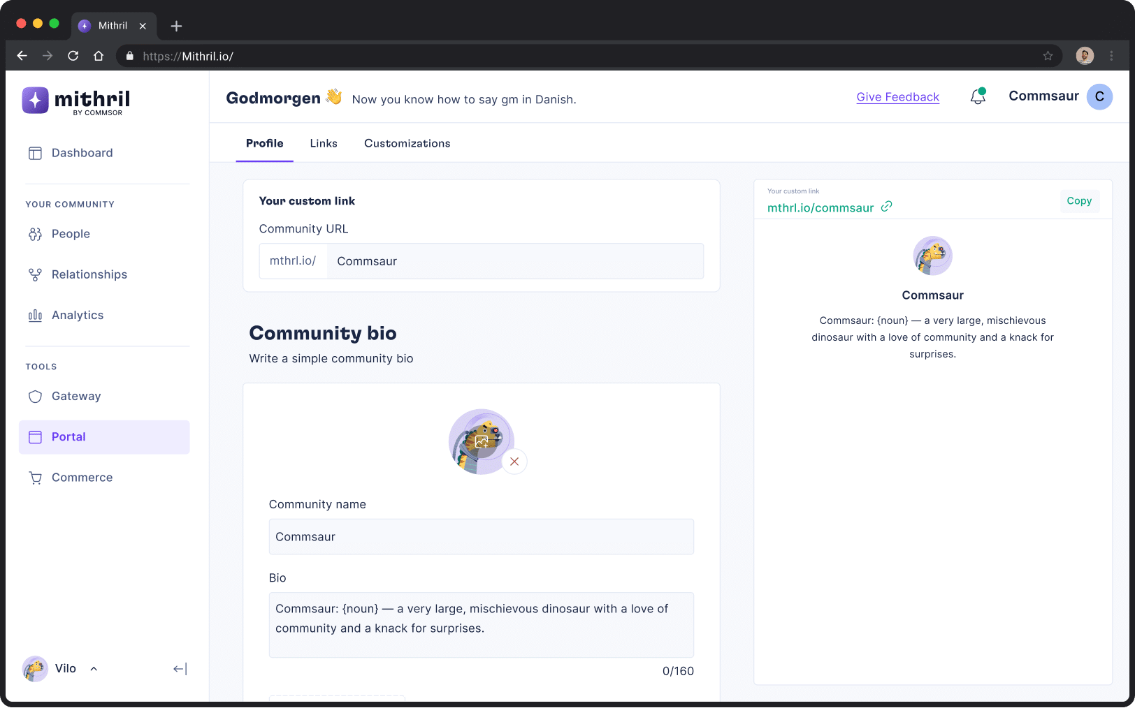
Profile
The first thing you need to do to set up your links page. On the profile page, there was a place for your community's unique link, a bio, and a layout choice.
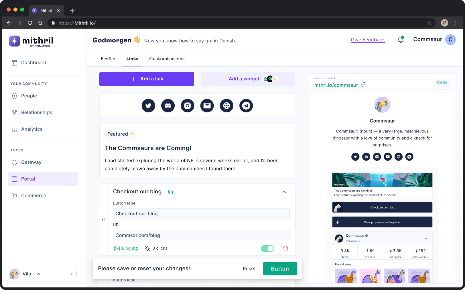
Links
The links page provided users a blank canvas to add their community socials, a featured link and other links important to them.
Here also was where communities could integrate widgets such as Opensea, Looksrare or Snapshot.
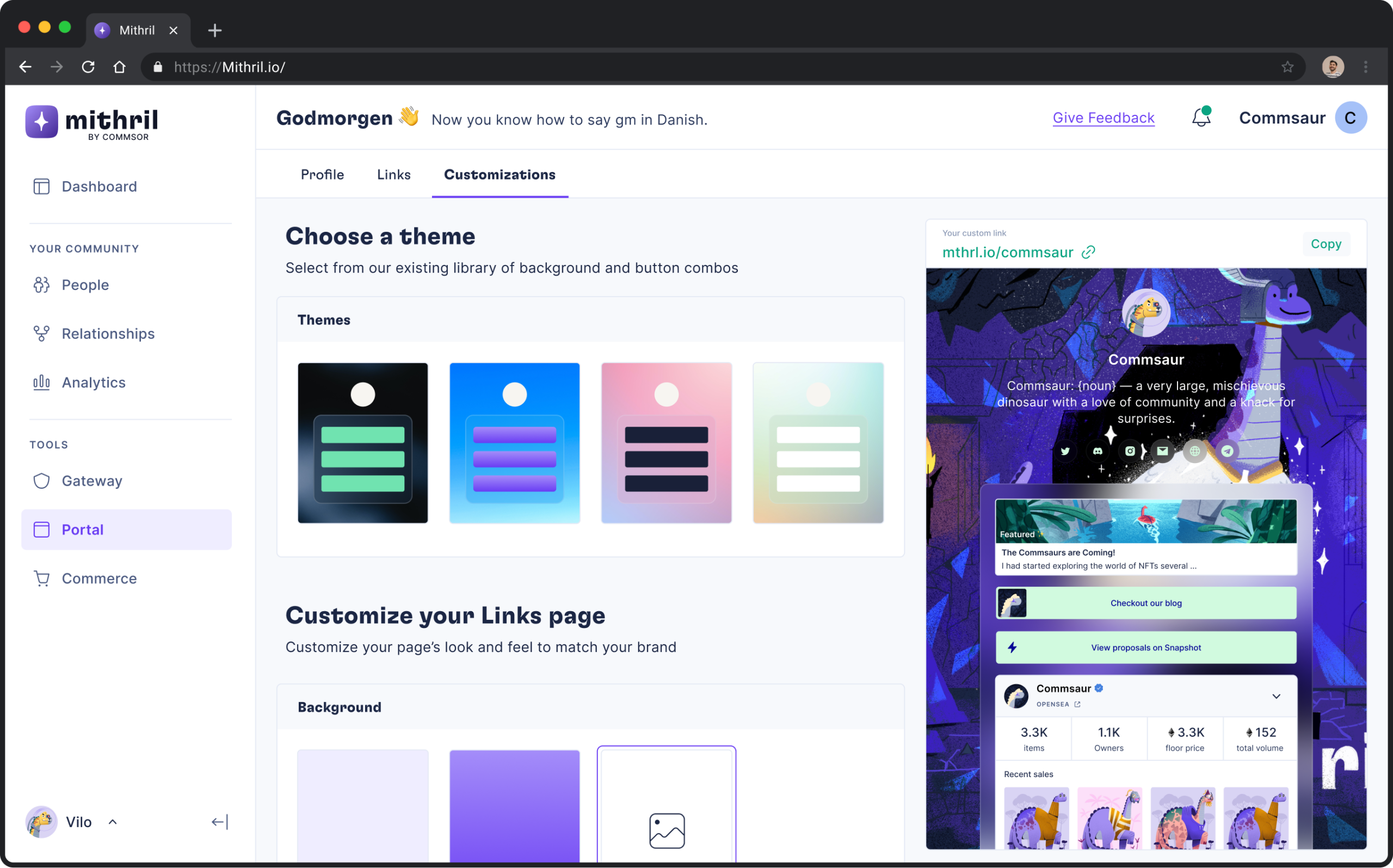
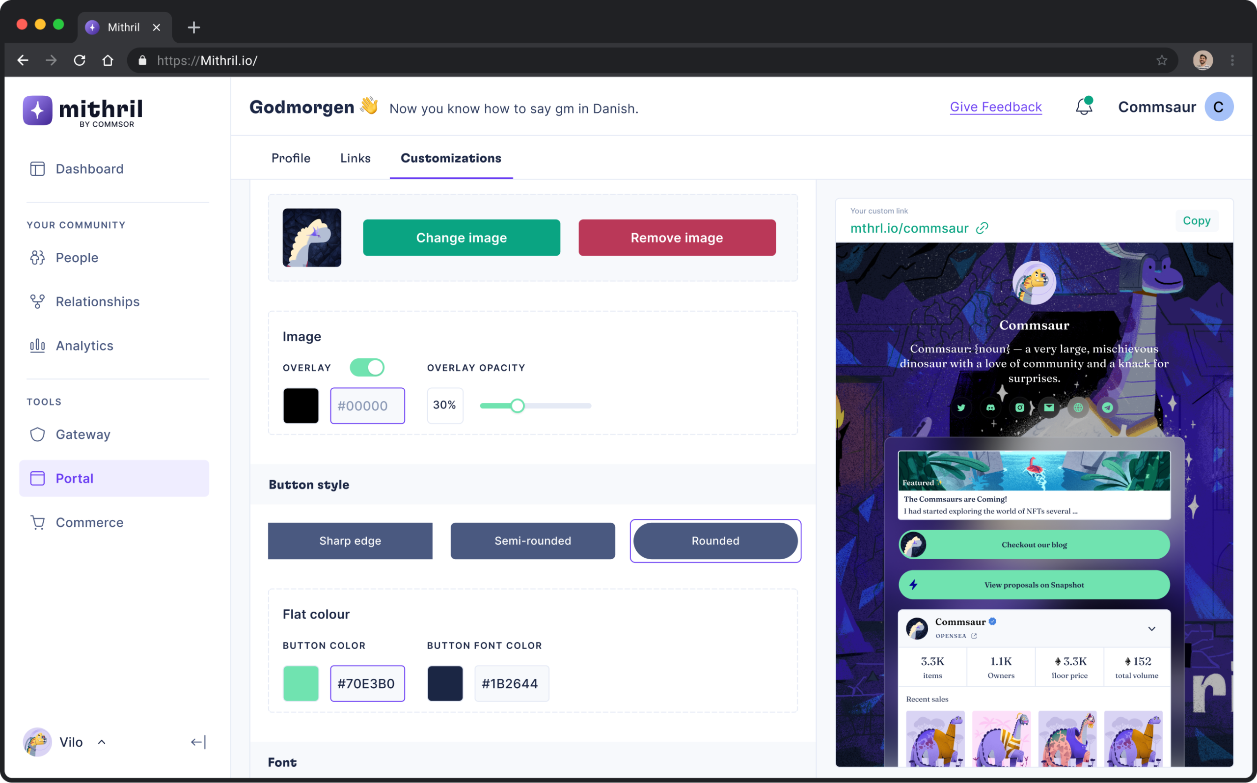
Customization
Communities could design their pages to match their brand. The options were premade themes, background customization, button style, font, colour and so on.
Learnings
When designing dashboards and other data-heavy apps, the goal isn't to put as much data as possible on the dashboard. Instead, the goal is to give your users useful, usable data. What information do these numbers convey? What can the person do with this information?

