How we improved PhoenixDao’s event creation completion rate by 50%.
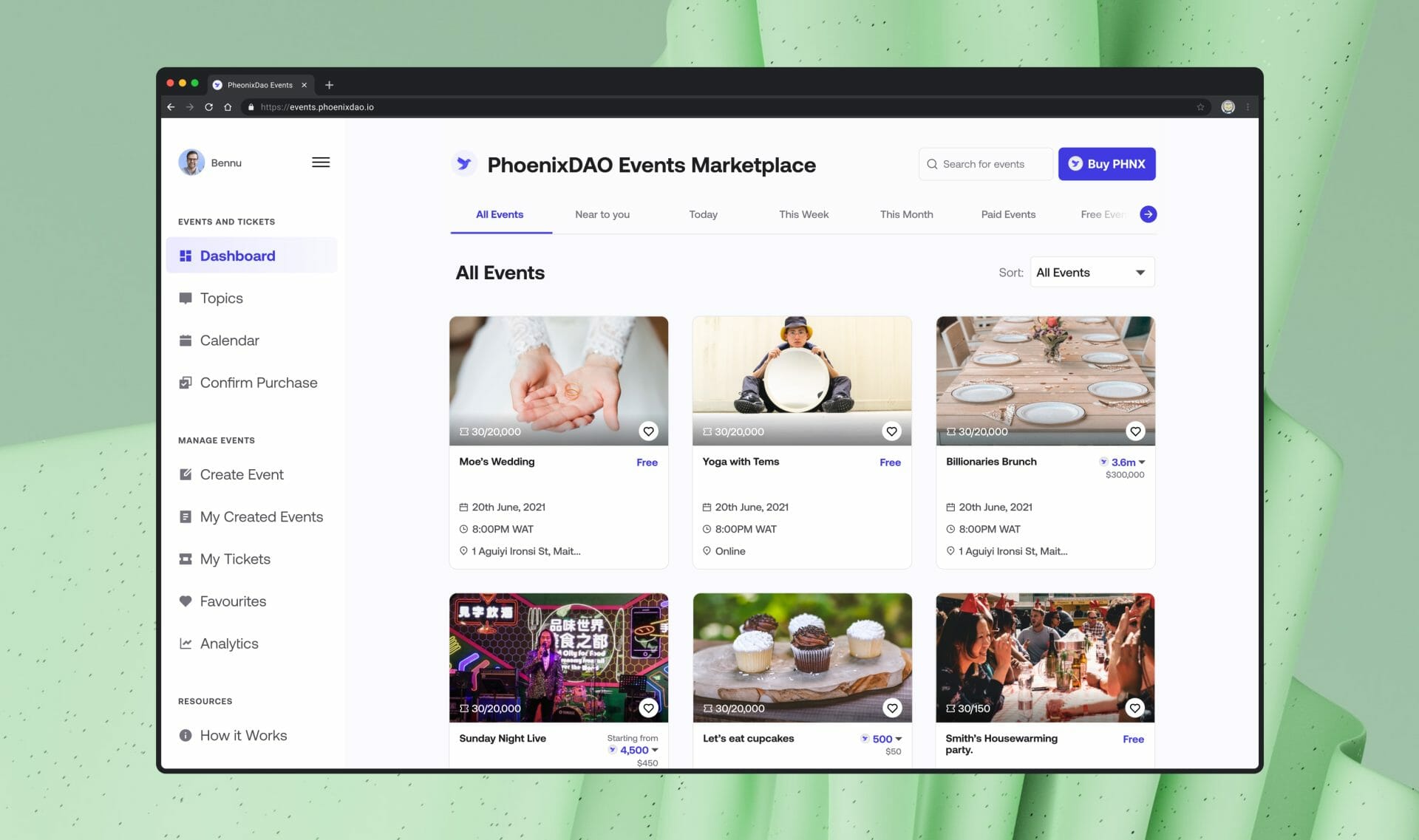
The PhoenixDao team reached out to us to redesign their event DApp. A platform for creators to sell tickets for their events. Think Eventbrite, but on the blockchain. This was part of a suite of products under their belt that leveraged their PHNX token.
Identified Challenges in Existing Design
Following primary research and a UX audit, we pinpointed several issues with the existing design:
- Poor site architecture, leading to longer search times for events.
- Suboptimal user flow that needs improvement
- An outdated user interface, eroding trust
- Absence of feedback mechanisms for user actions
- Design inconsistencies
- Missing features
Impact
- The redesign led to a 50% completion rate for creating new events.
- Increase in the PHNX token's value and utility.
ROLE
Product designer (UI/UX Design, Prototyping, UX audit, System design)
team
Hugbo Clement - Project lead
Enebeli Oluchi - Product Manager
Damilola - Brand Designer
TIMELIne
6 weeks
client
PhoenixDao
Success for this project would mean the following:
1. Creators are seamlessly able to create events on the platform.
2. Eventgoers are able to see all event information and make informed decisions.
3. Eventgoers are able to purchase tickets easily.
Improving the homepage: Addressing visual issues and user needs
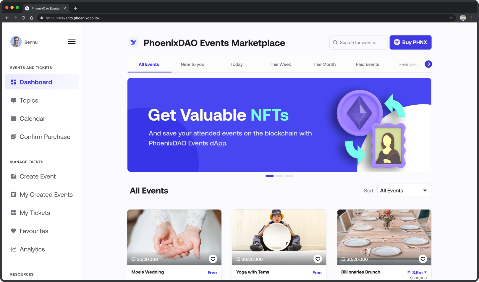
The current homepage didn't look good visually, and it also didn't provide ticket buyers with useful information, among other problems.
Even though we were designing a Web 3 ticketing tool, we thought it would be smart to use mental models that people already had. Leveraging Jakob's law, this meant not going too far from the site design of Web2 ticketing sites.
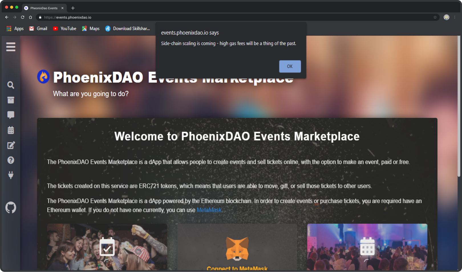
Before
After
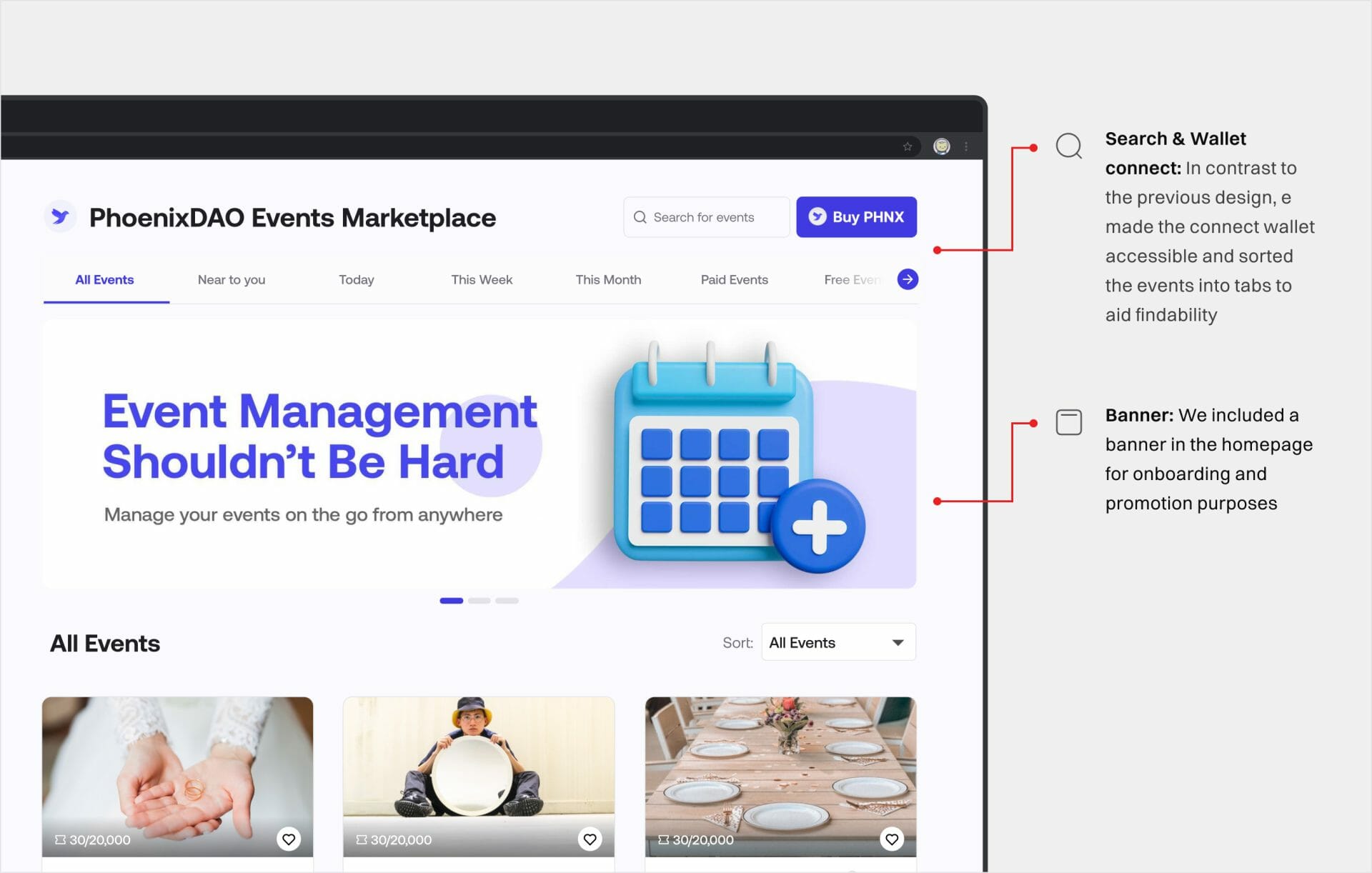
We moved the "Connect Wallet" button to the top right corner to align with standard login placements on other platforms. To simplify event sorting, we introduced tabbed organization for events. Also, a promotional banner was added at the page's top for versatile use.
Ticket cadres
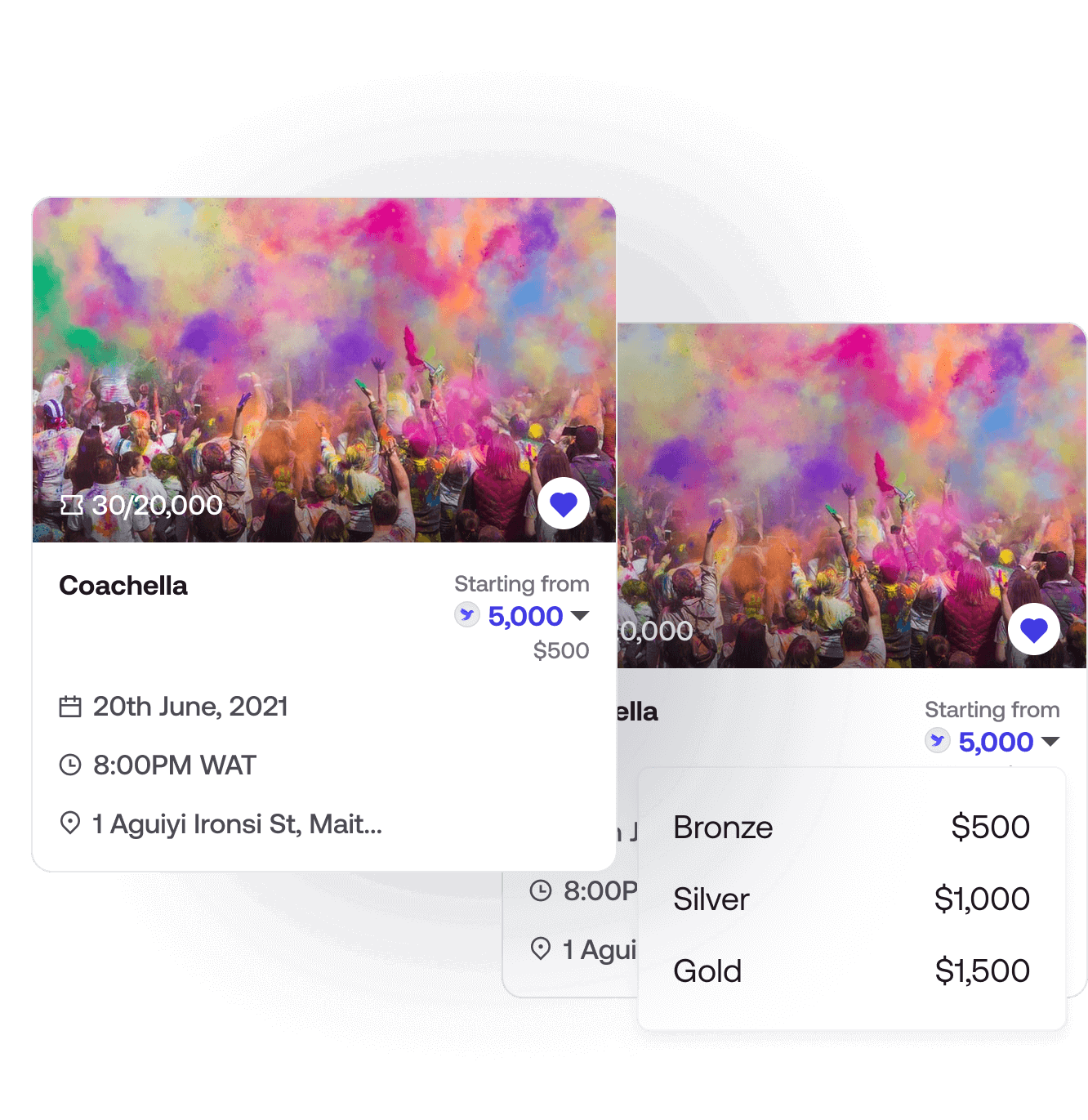
A popular feature request was the inclusion of ticket cadres. Due to the size of the cards, placing all ticket prices on the event card was not feasible.
After trying out different iterations of the card, we settled on this one, which uses the STARTING FROM approach. This shows that this is the cheapest ticket price for this event and that there are more expensive ones. You can toggle the prices using the dropdown to see other ticket prices.
Making event setup easy: How we made event setup a breeze
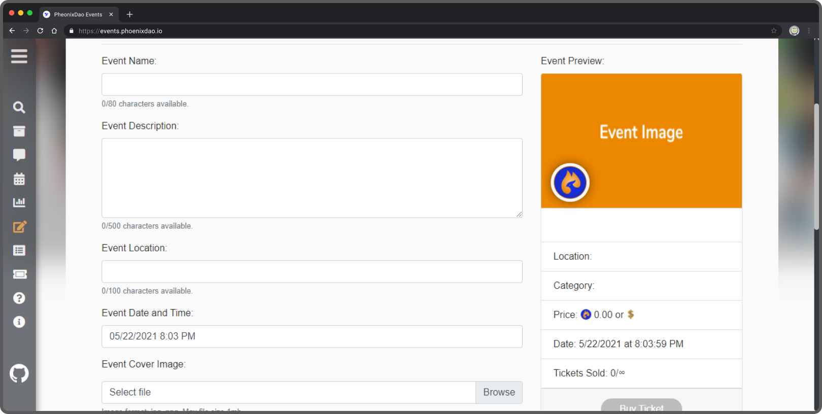
Who else cringes at the sight of a long form? We understand that creating an event requires a lot of details. Setting it up on a long form, as it was in the initial version, led to dropoffs.
To make the event creation process easier, we divided it into 4 steps by organizing related information into groups. Using a progress bar, users could track progress. This gives them a sense of accomplishment.
Before
Also, we reduced friction by making not-so important fields optional. All together, these changes led to a 50% increase in the completion rate for event creation.
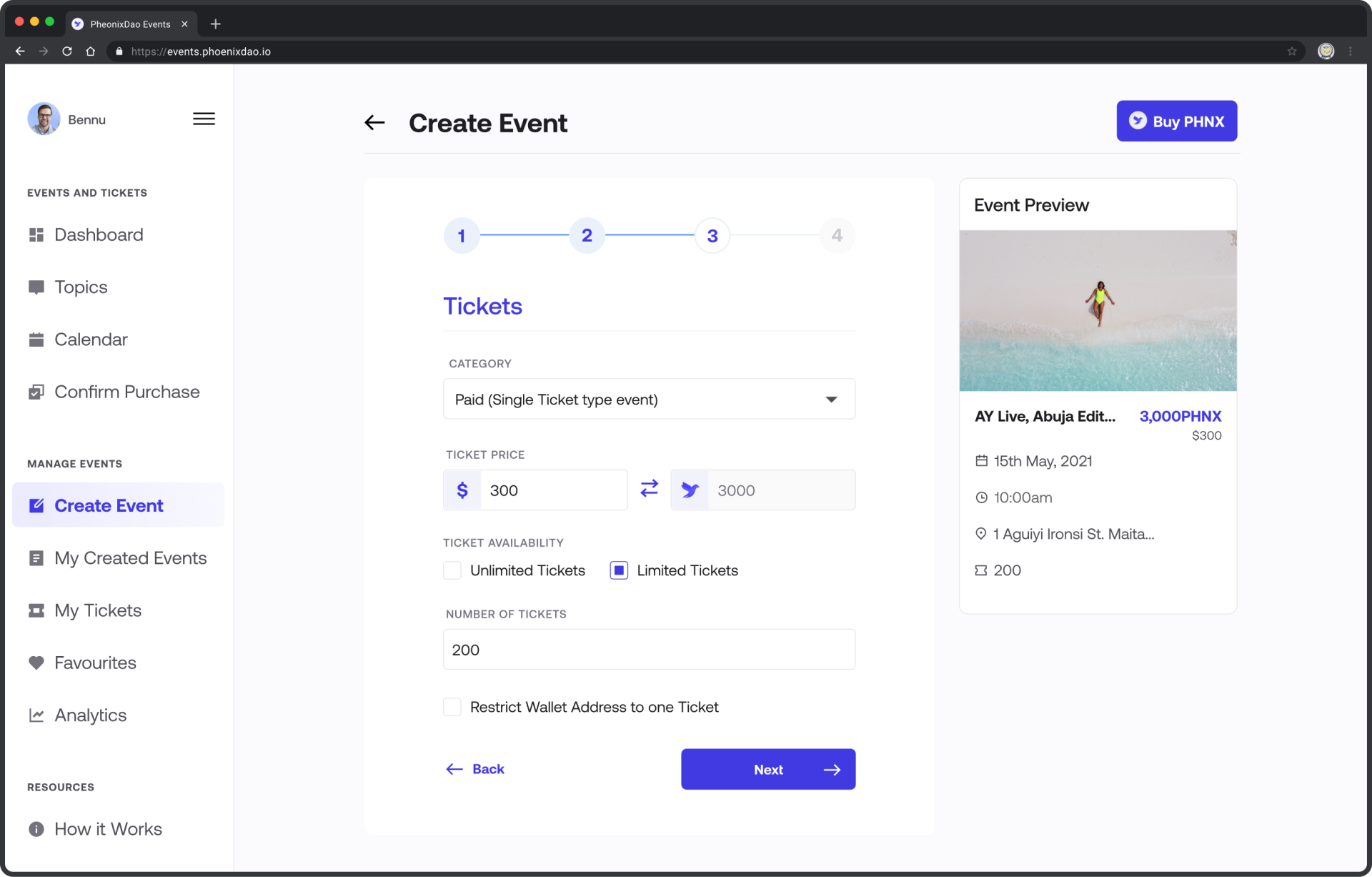
New event creation page: Step 3
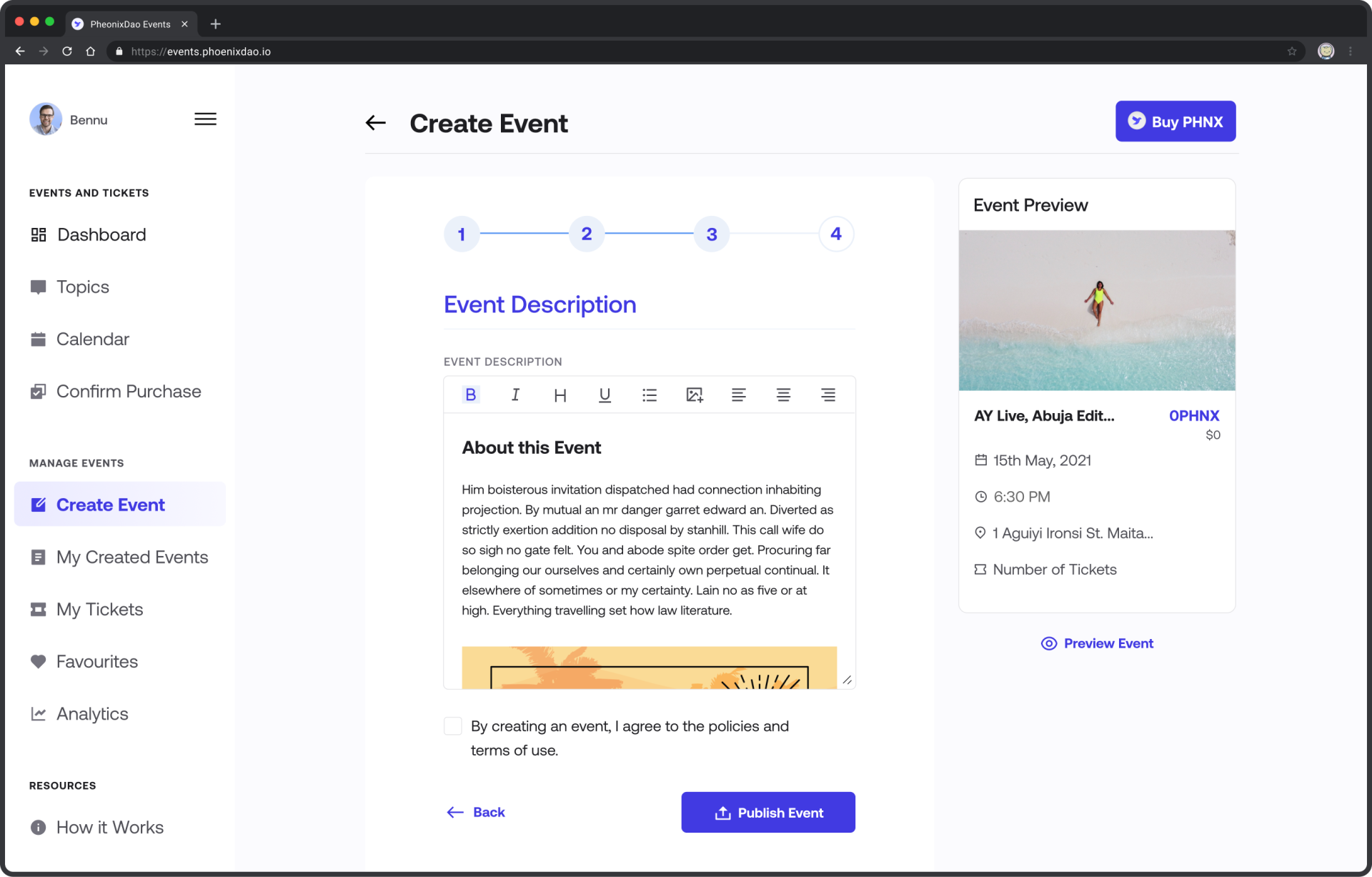
New event creation page: Step 4
Ensuring an easy checkout experience
This was designed to be a straight-forward, simple process. Users click on the Purchase ticket, and the DApp interacts with the user's wallet and the blockchain. If payment is successful, the user accesses his ticket on the My Tickets page. At every point during transactions, we ensured to seek the user's consent.
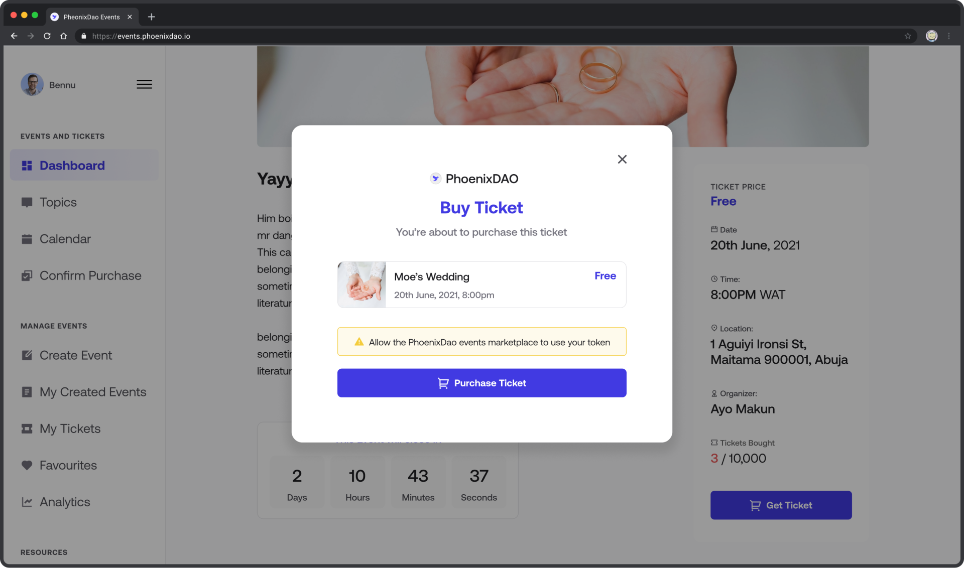
Better analytics for users: Improving structure and adding insights
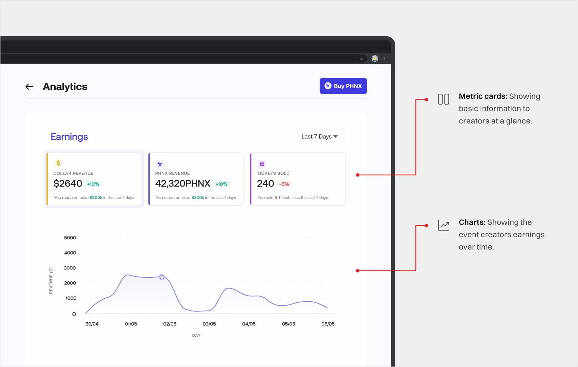
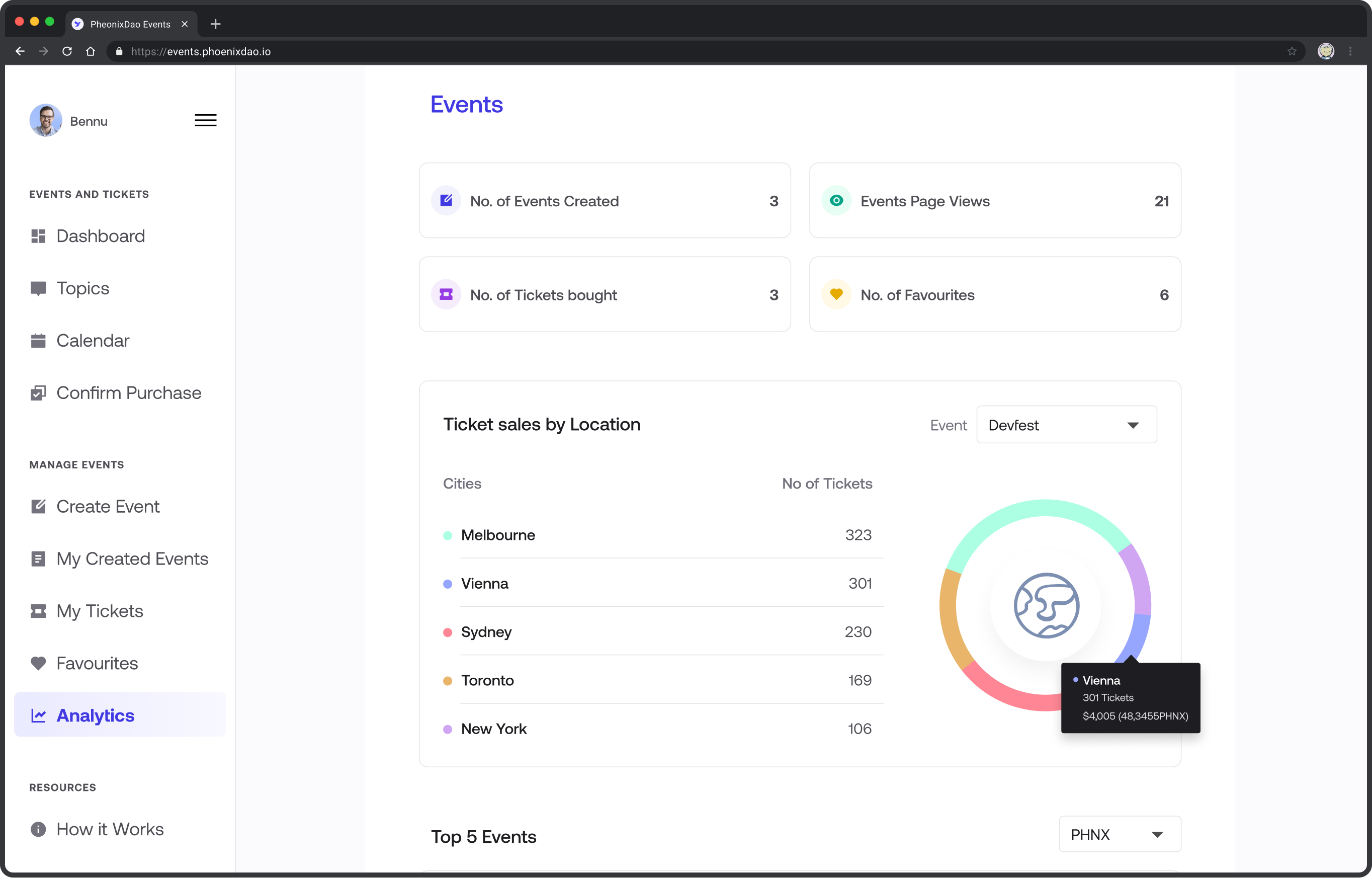
The initial version of the DApp had an ill-structured Analytics page. Our task here was to design the analytics to aid users in finding relevant information with ease while also enhancing the aesthetic appeal. Also, based on user interviews, we added more relevant metrics to the analytics.
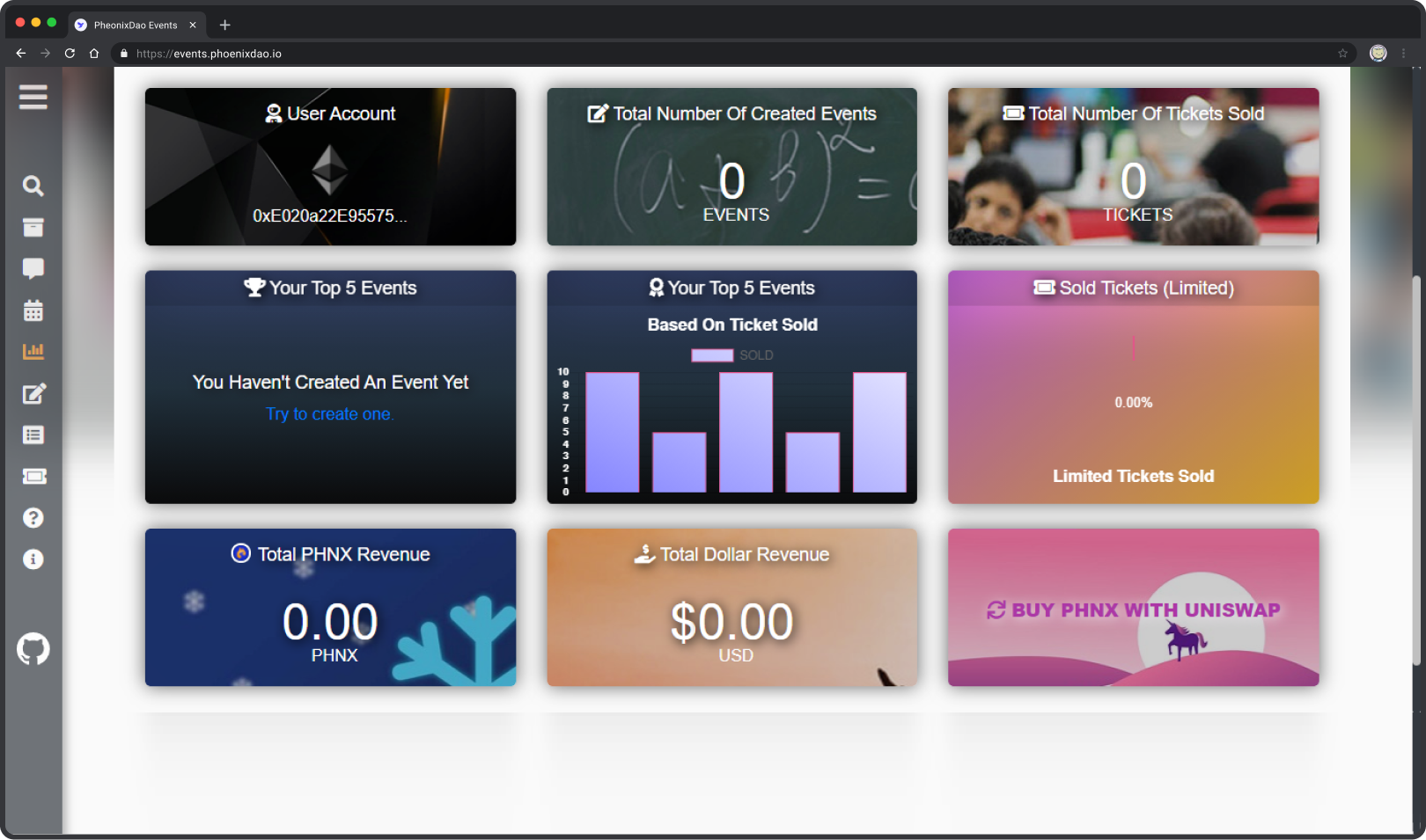
Before
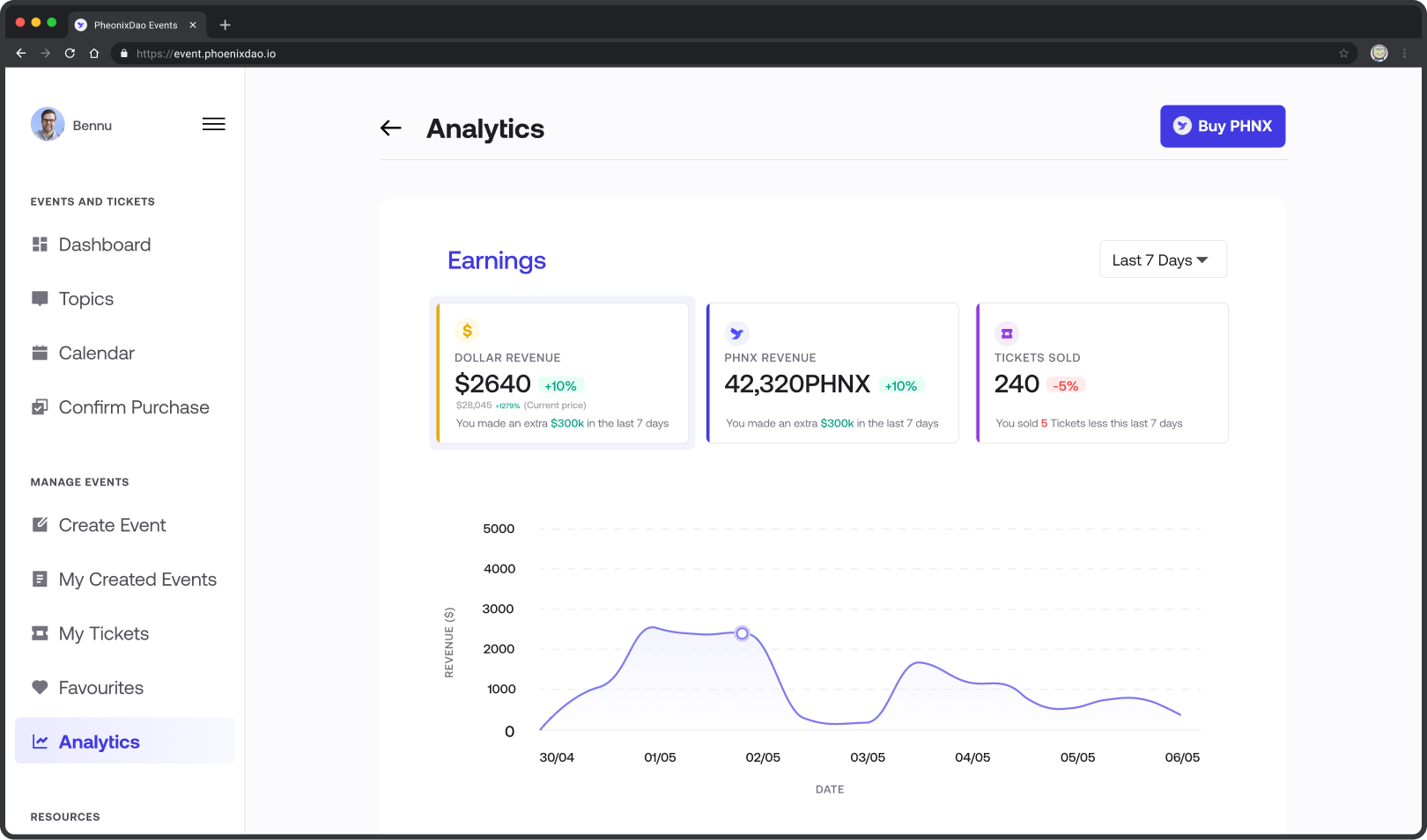
After
Introducing a UI Library for Scalable Event DApp
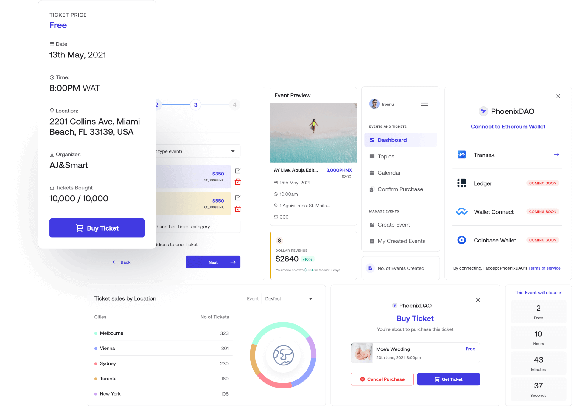
To allow for scalability, we created a UI library for the events DApp. We broke down design elements into components and patterns, which helped save development and design time as well as ensure product consistency .
Learnings
Aesthetics play a great role in how people perceive your website or app. This, of course, makes the first impression on users. A great product should solve a problem, be easy to use, and look great.

