The design of a web experience using the Golden Canon grid.
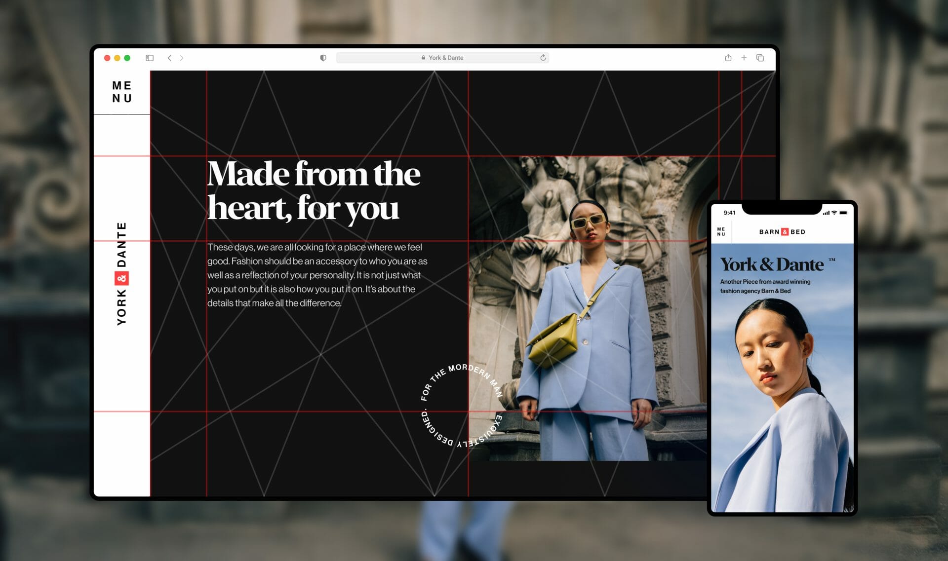
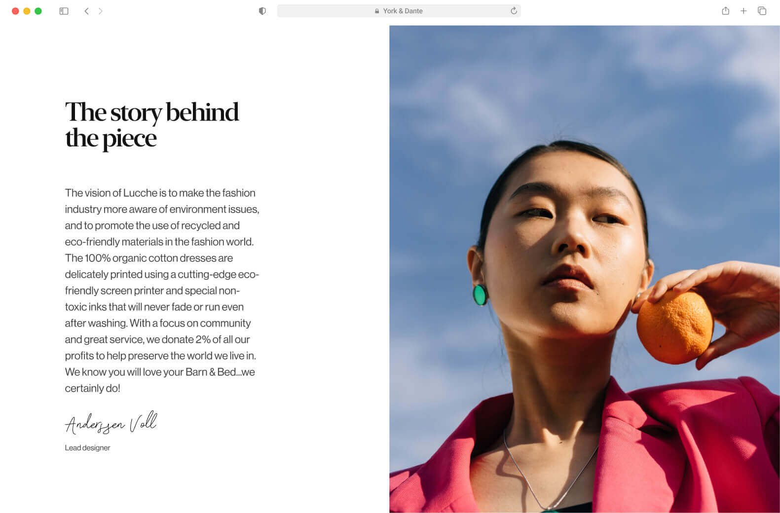
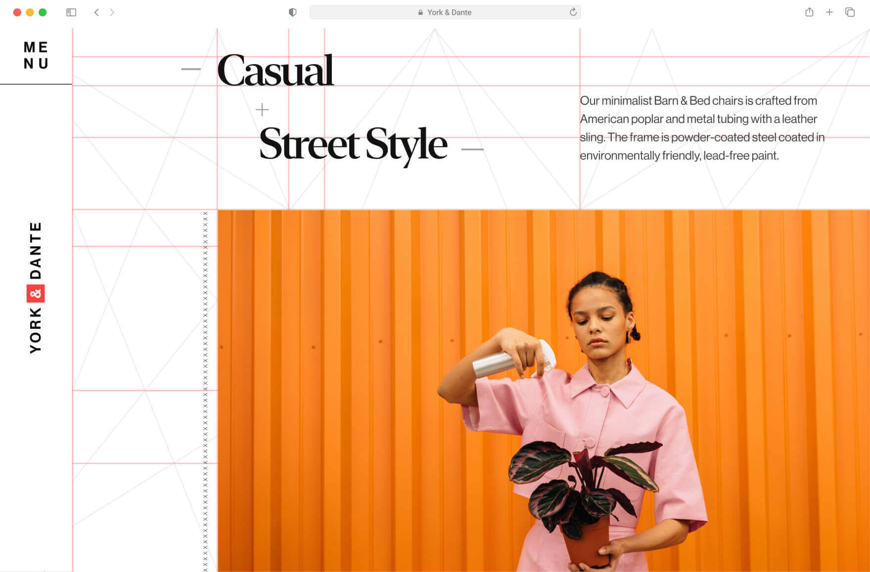
While strolling around the web. I stumbled on a great collection of photos by Cottonbro on Pexels. The goal here was simple: Use the Golden Canon grid to create a web experience that scrolls horizontally.
ROLE
Web Designer (Art Direction, Prototyping)
team
Oluwatobi Judah - Motion & Development
timeline
2 weeks
picture credit
web link
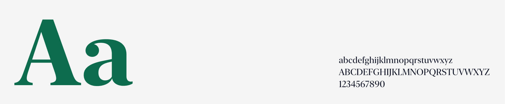
Typeface
New York Extra Large
For headings and titles
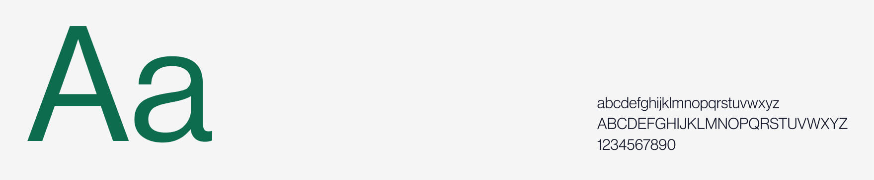
Neue Haas Grotesk Display
For paragraphs and other metadata
Color scheme
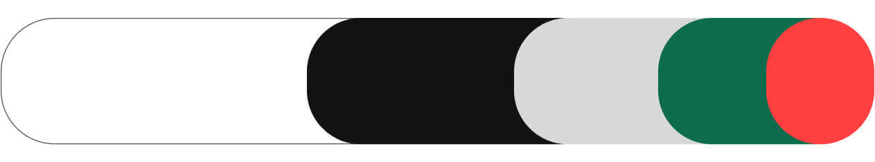
Designing the look and feel
For the art direction, I wanted the website to have a sophisticated appearance, drawing inspiration from the photo collection. This informed my choice of my heading font, New York. For colors, I stuck to neutral colors so that the photos could stand out.
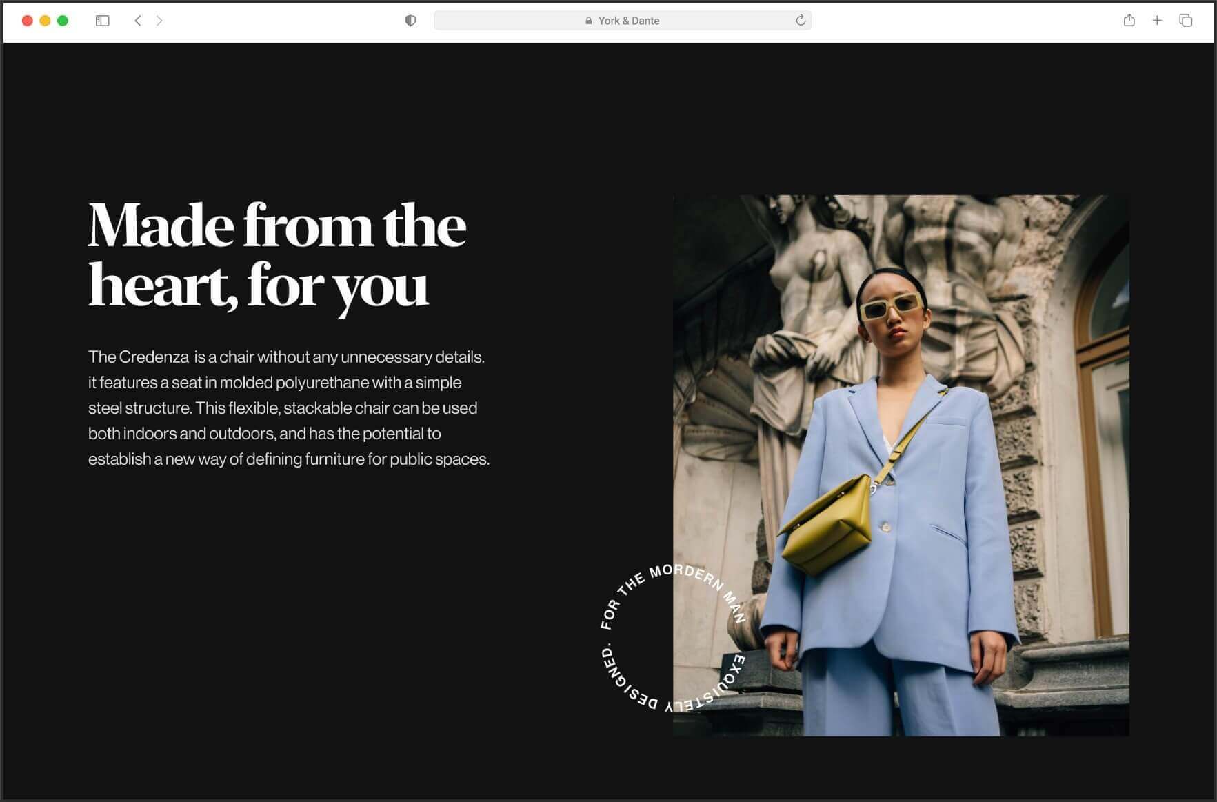
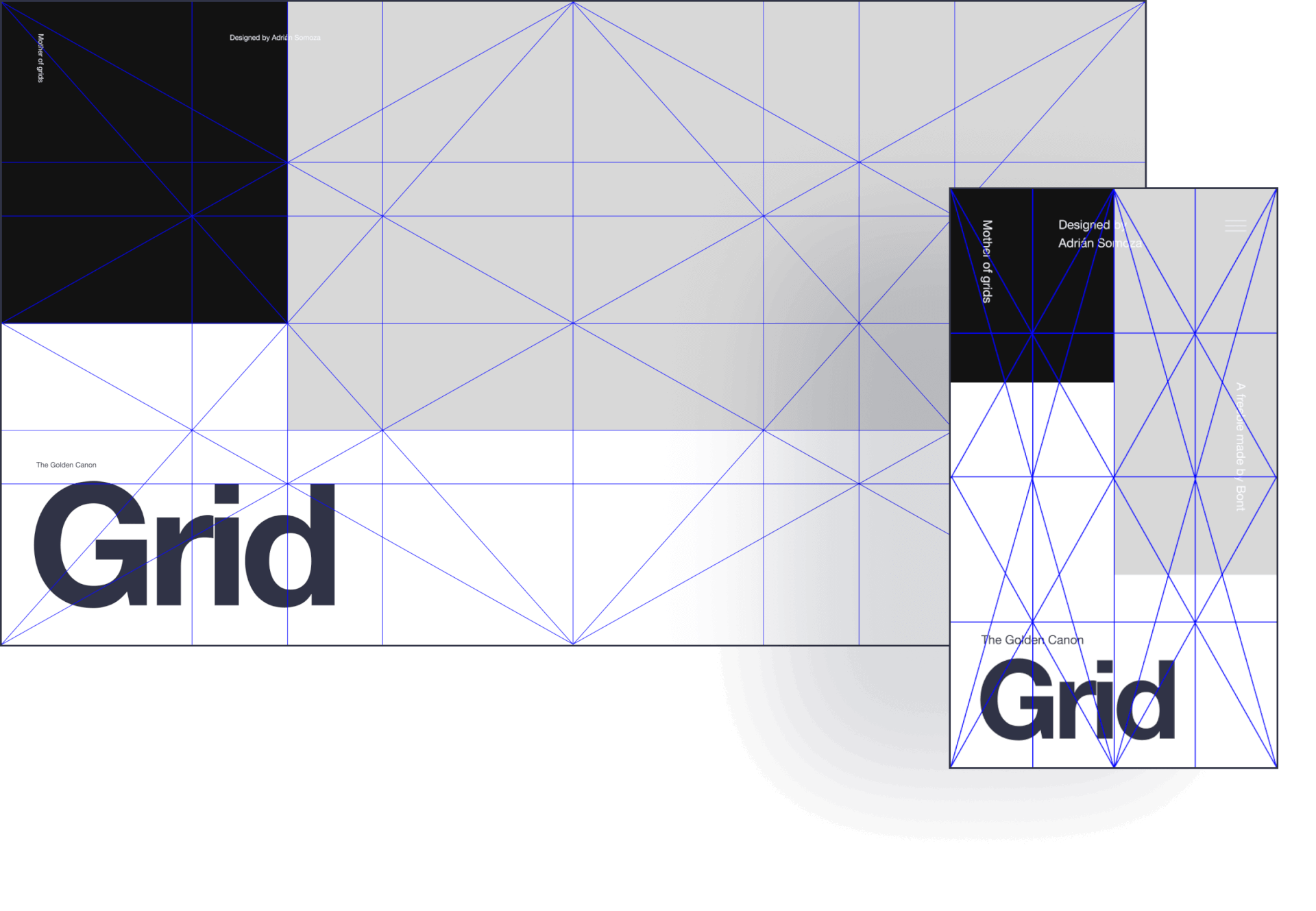
Creating visual interest: The golden canon grid's unique intersection
An intersection of diagonal and vertical lines makes the Golden Canon grid. Most of your design assets would sit at this intersection of lines. The grid allows for a more interesting and modular layout.

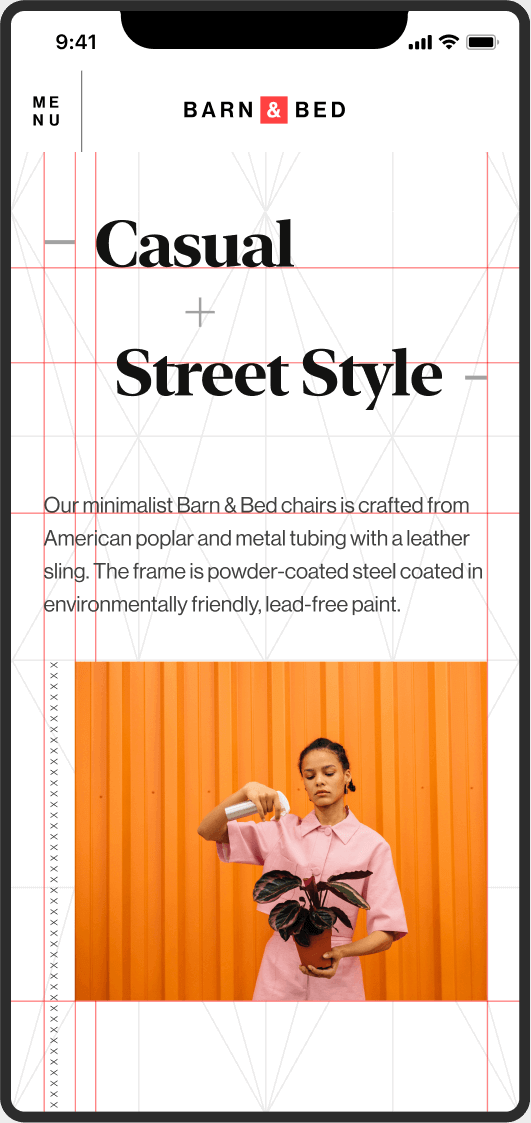
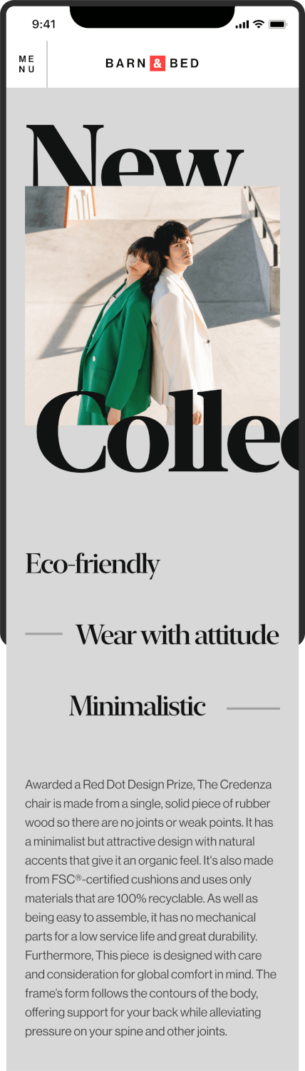
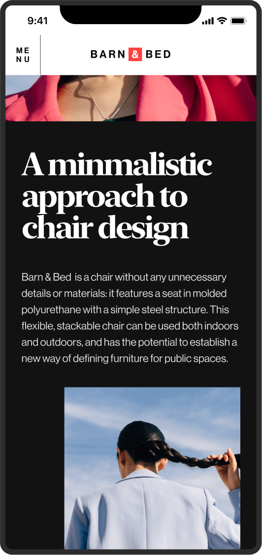
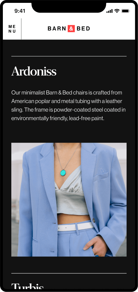
Mobile Compatibility: Making the design work seamlessly everywhere
More websites are being looked at on mobile phones than ever before. It was important to make this experience work on mobile. To maintain the same experience on mobile, we had to make some trade-offs.
Learnings
1. Collaboration with developers requires tradeoffs. I changed some parts of the first design and made some changes to get to this final form.
2. Grids are powerful, but don't get stuck on them. As your design might demand, break the grid.
You might also like ↴
©Felix Enyinnaya