Mithril Analytics: Unifying Data for 250+ Web3 Communities.
Context
In early 2022, Commsor acquired community analytics tool DeepALTR, rebranding it Mithril with a larger vision: to become a complete Community OS with four key pillars: Analytics, Portal, Gateway, and Commerce.
I led the end-to-end redesign of the Analytics pillar, turning raw data into clear visuals for community tracking and growth insights.
Problem
Web3 community managers struggled to gain a clear view of their communities. Data was fragmented across Discord, Twitter, on-chain activity, and more, making it difficult to effectively measure growth, engagement, and retention.
Solutions
My redesign unified scattered data into one intuitive dashboard, empowering community managers to:
- Clearly track growth, engagement, and activity trends.
- Identify key contributors and visualize relationships.
- Consolidate member information and interaction history.
Impact
After the acquisition, I was brought in to redesign DeepALTR's community analytics platform, which is used by more than 250 Web3 communities. The redesign addressed the core challenges by
- Reducing the time it took community managers to gather and interpret key metrics by 50%
- Improving the readability of the relationship graph for 70% of test users.
- Establishing a clearer dashboard layout and visual hierarchy for better decision-making.
Role
Product Designer
Team
Cole Zerr - Product Manager
Erik Rosemberg - Lead Engineer
Will Depue - Engineer
Dexter Molina - Engineer
Santi Arredondo- Engineer
Naren Gaurav - Community & BD
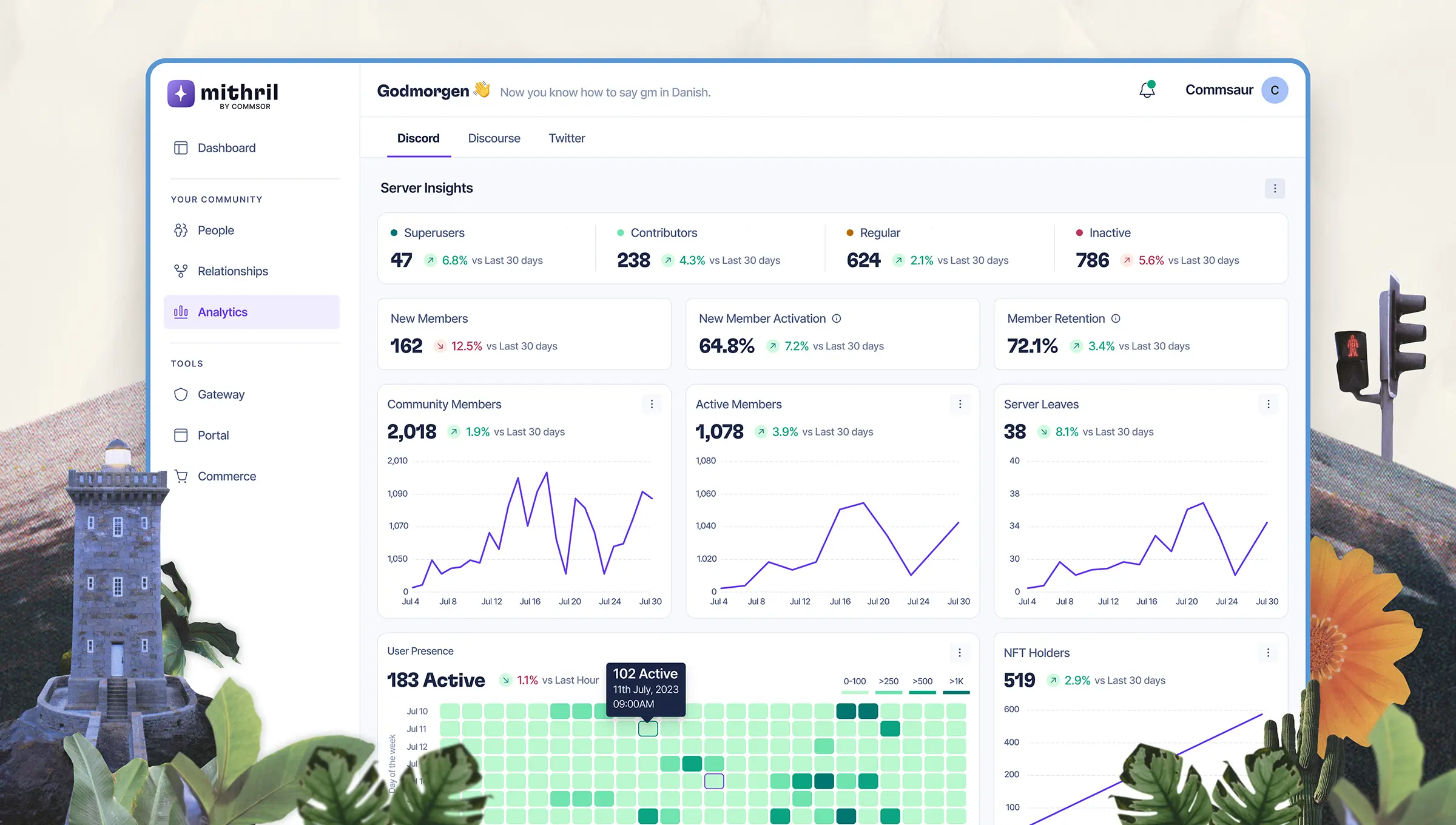
Analytics page: Understanding Activity at a Glance
The Analytics page helped managers make sense of community performance without switching tools or crunching data. It highlighted key metrics like
- Member growth, activation, and retention
- Active contributors, drop-offs, and lurker patterns
- Trending discussions and message volume across channels
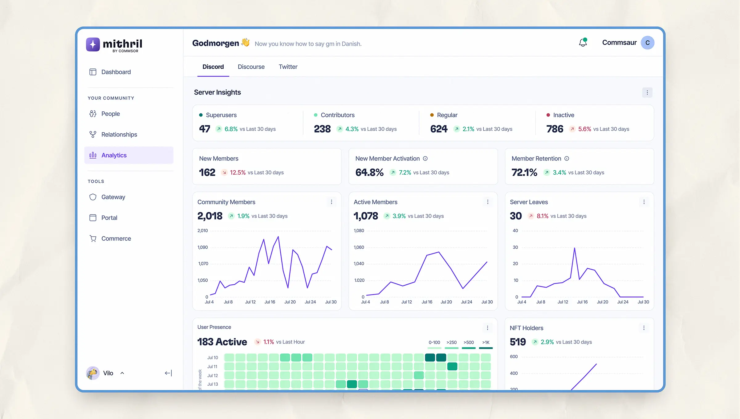
Server-level insights showing member growth, activation trends, retention, and user presence over time.
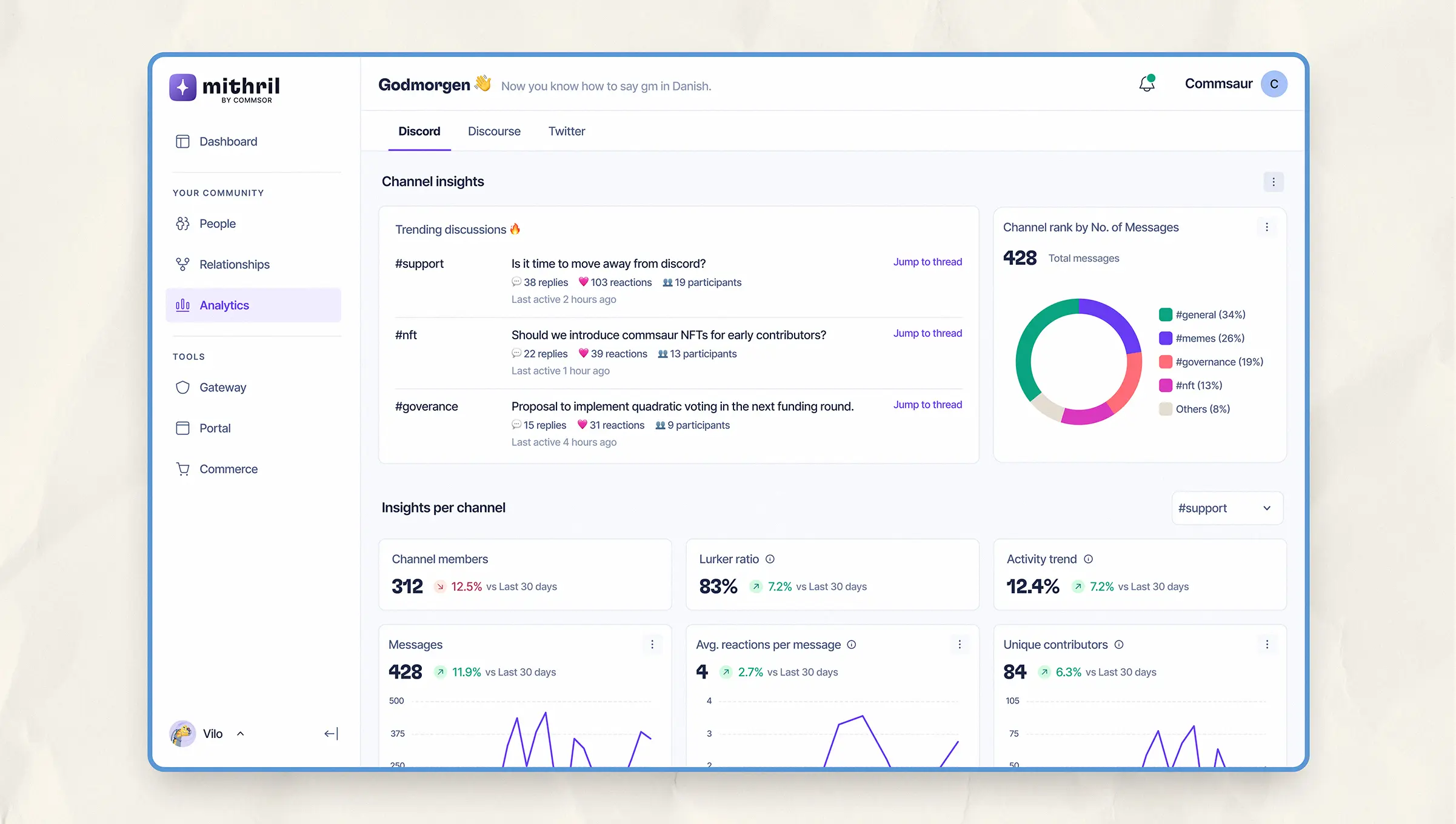
Channel-level analytics showing trending discussions, message breakdowns, and engagement metrics across Discord.
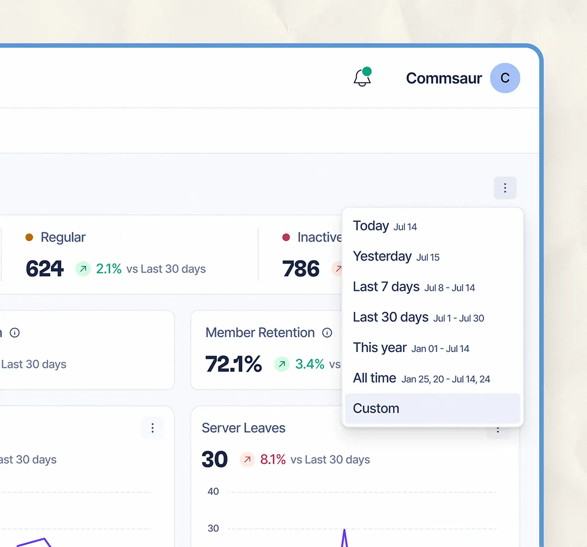
Users could filter insights by predefined or custom time ranges. Ideal for spotting trends over specific periods.
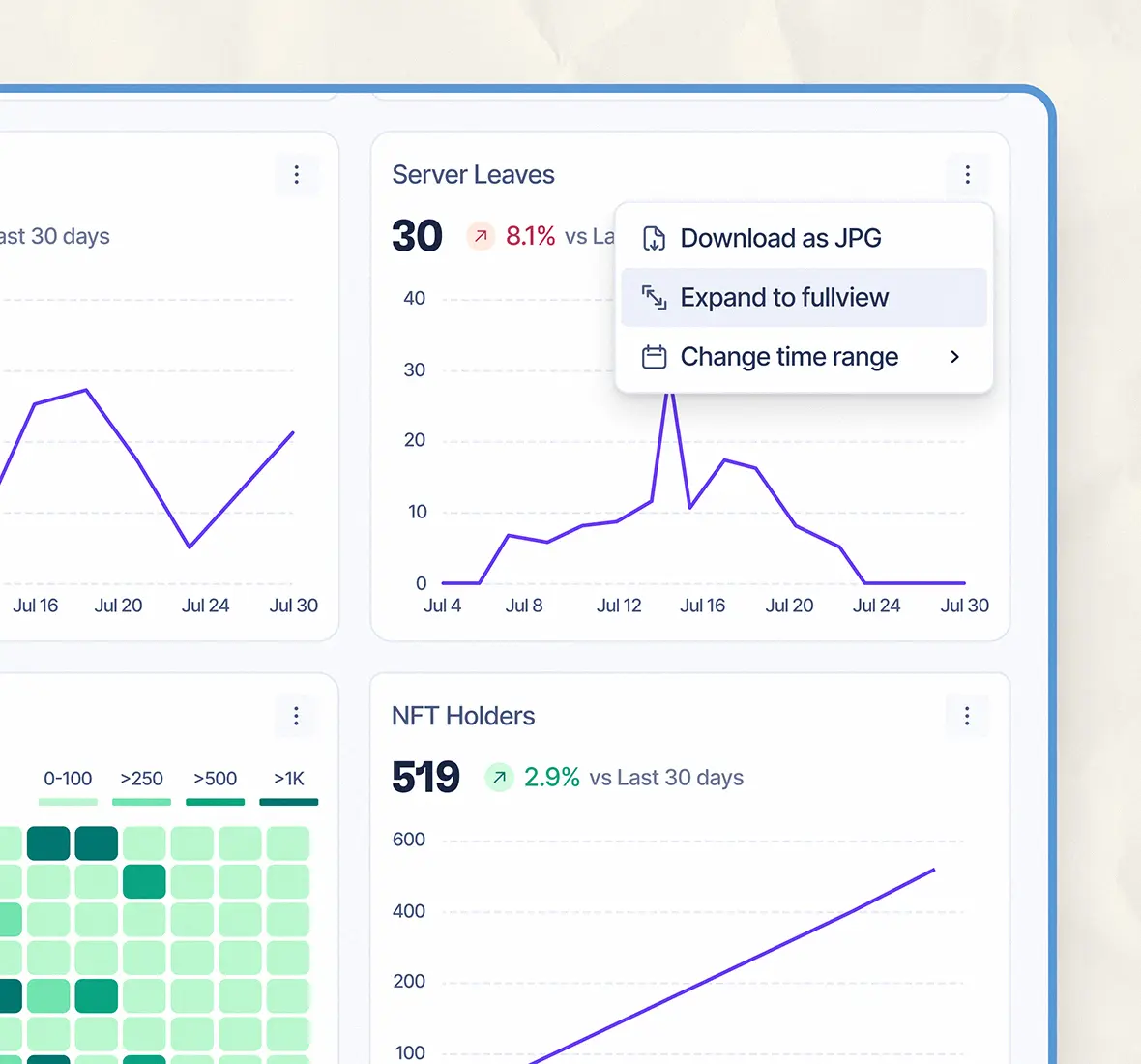
Each chart came with export and view options, allowing managers to zoom in, change date ranges, or download data.
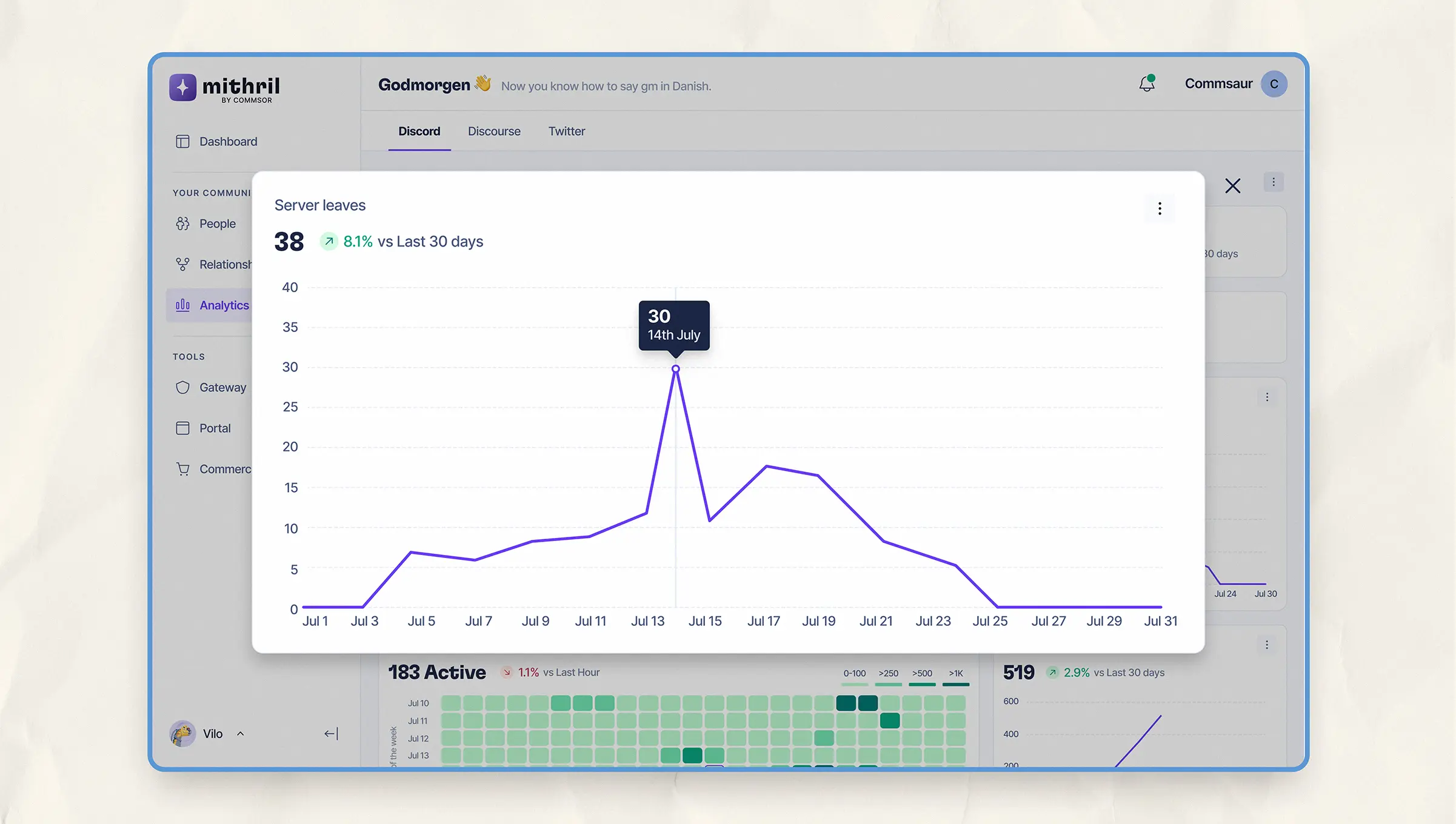
Full-screen mode offers a broader view of your chart, helping you dig into the details.
Relationship page: Mapping Community Connections
The Relationship page showed how members were connected, active, or starting to drift. It;
- Visualized the web of member connections across the community
- Showed strong, weak, and fading links to help managers understand how members were communicating
- Highlighted top contributors and clusters to watch
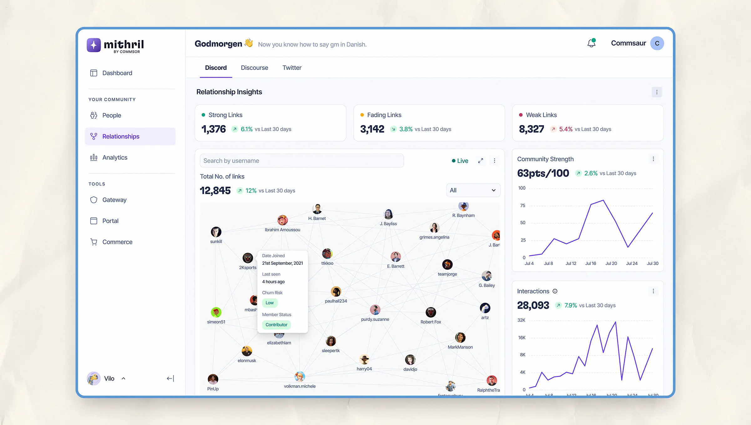
The relationship chart displays member interconnections along with trends in strength, interactions, and community structure. On hover, it presents more information on particular members.
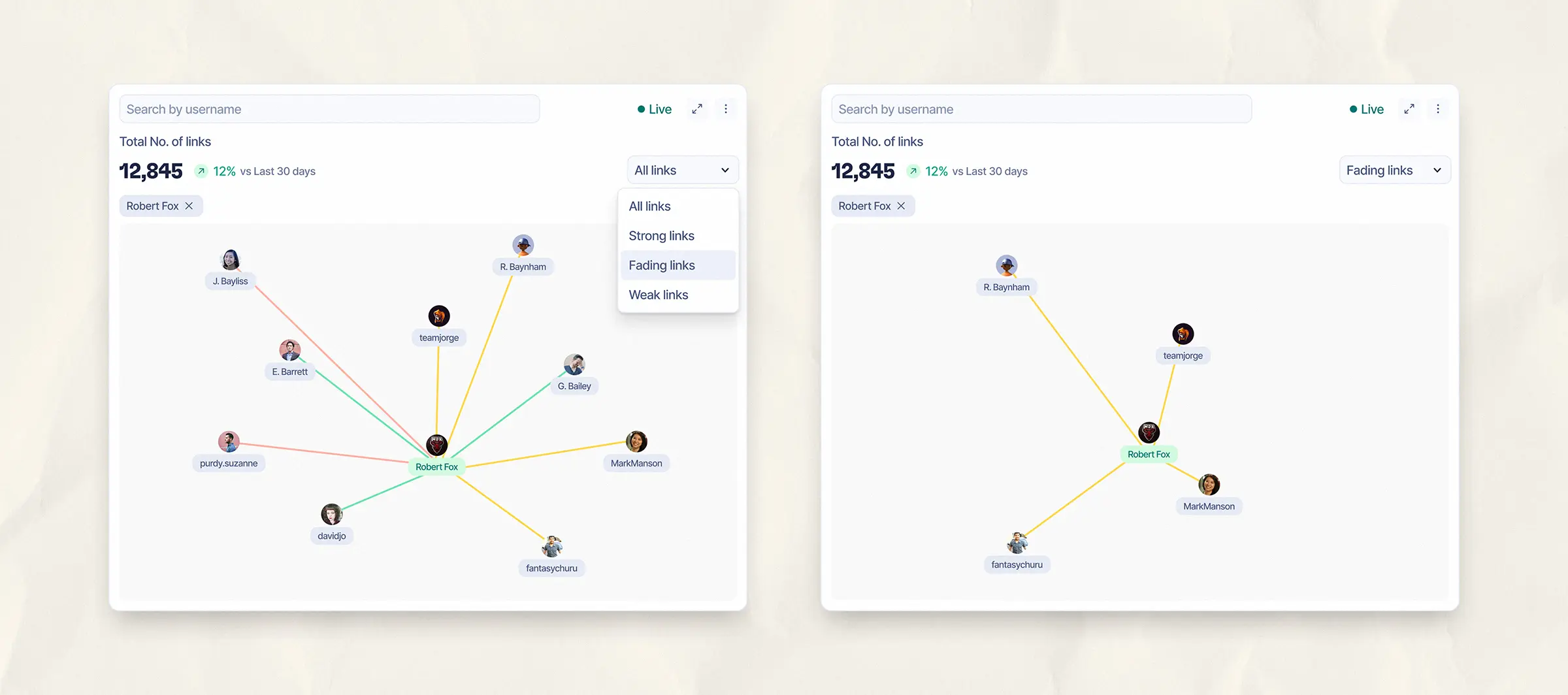
Filter view showing strong, fading, and weak links for an individual member, helping managers assess engagement strength at a glance.
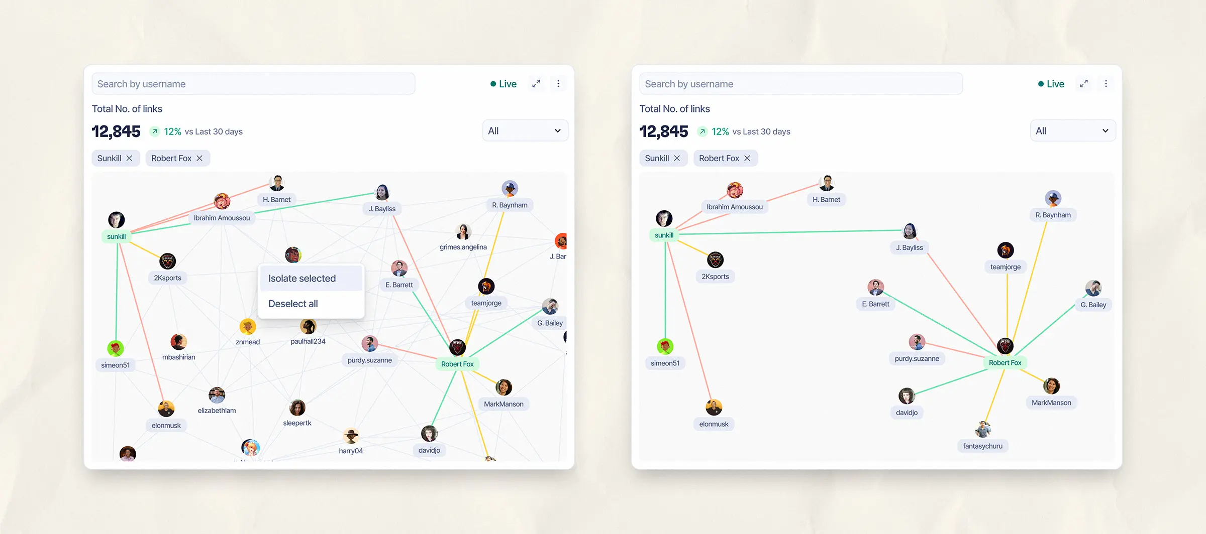
Visualizing mutual connections between selected members with the ability to isolate interactions. This change increased the ease of scanning by 70%.
People page: Getting the Full Picture on Every Member
The People page brought everything about a member into one place: wallets, social accounts, tags, and activity. it;
- Combined identity, activity, and platform data in a single view
- Let managers filter by roles, platforms, or engagement status
- Gave full engagement history, top channels, and relationship map per user
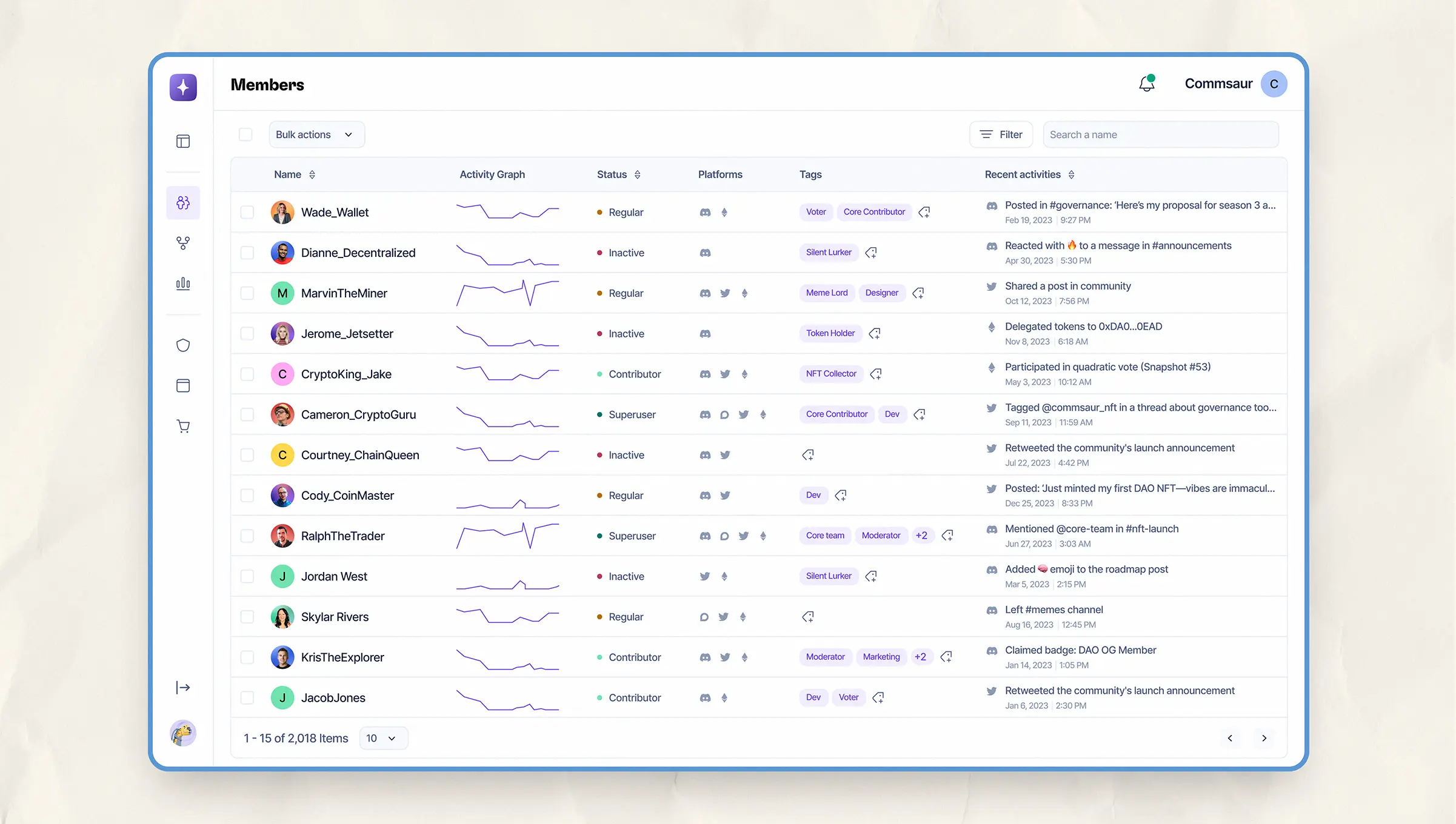
Members table with platform tags, activity graphs, and engagement status. Designed for quick scanning and bulk actions.
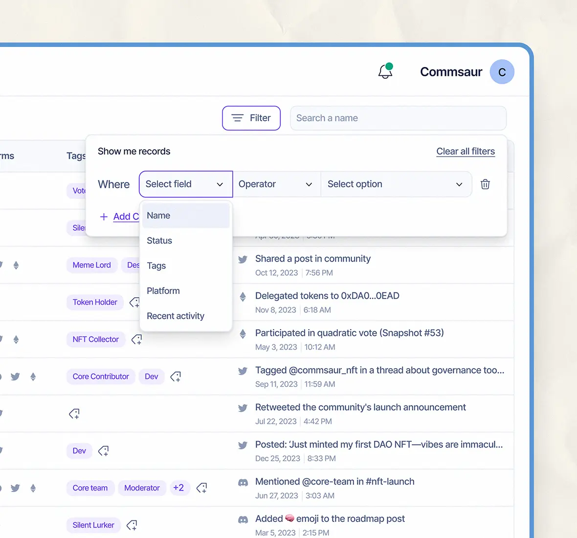
Flexible filters let managers search by name, tag, platform, or activity status.
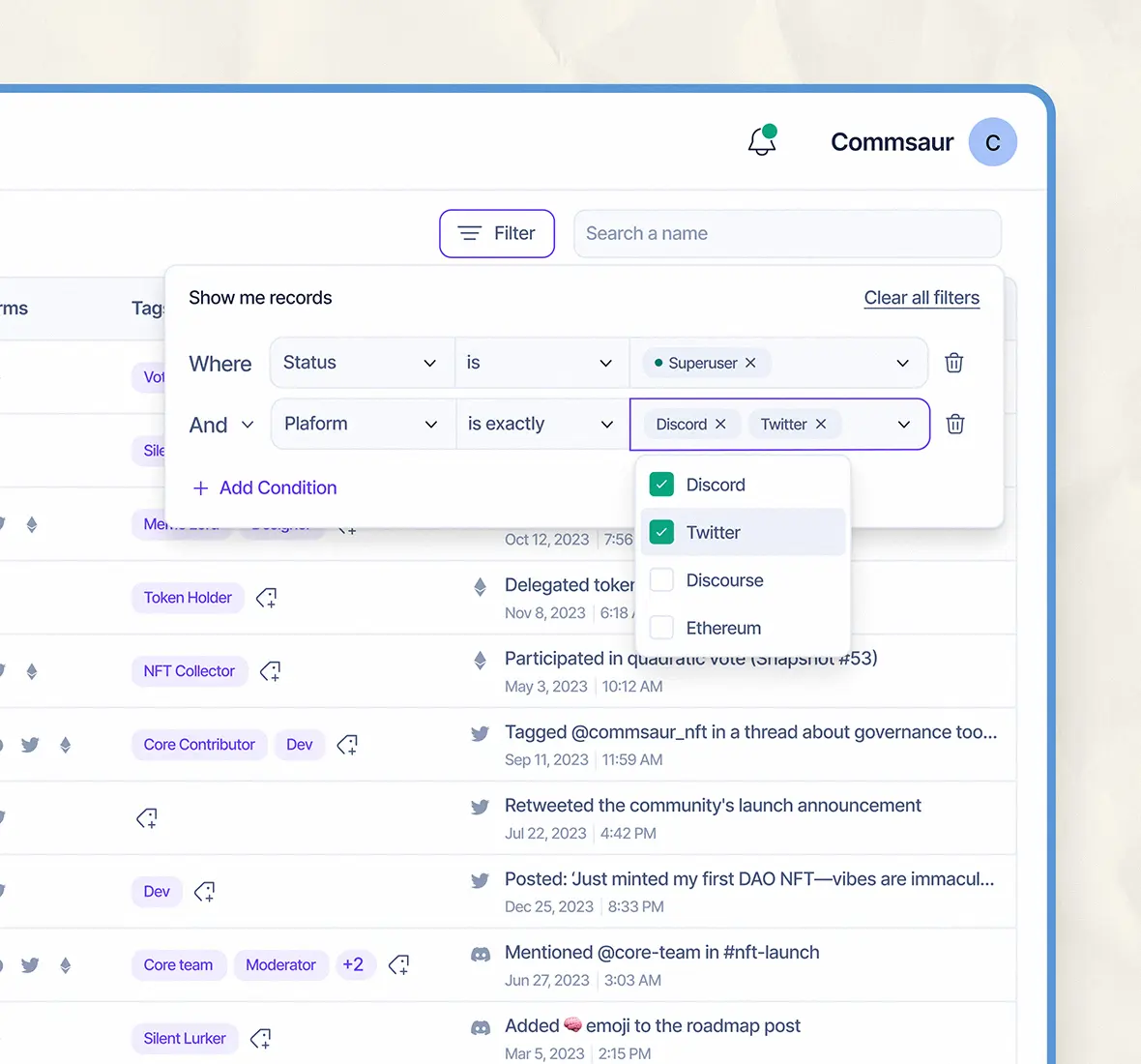
Filter options can be expanded for more accurate and granular search.
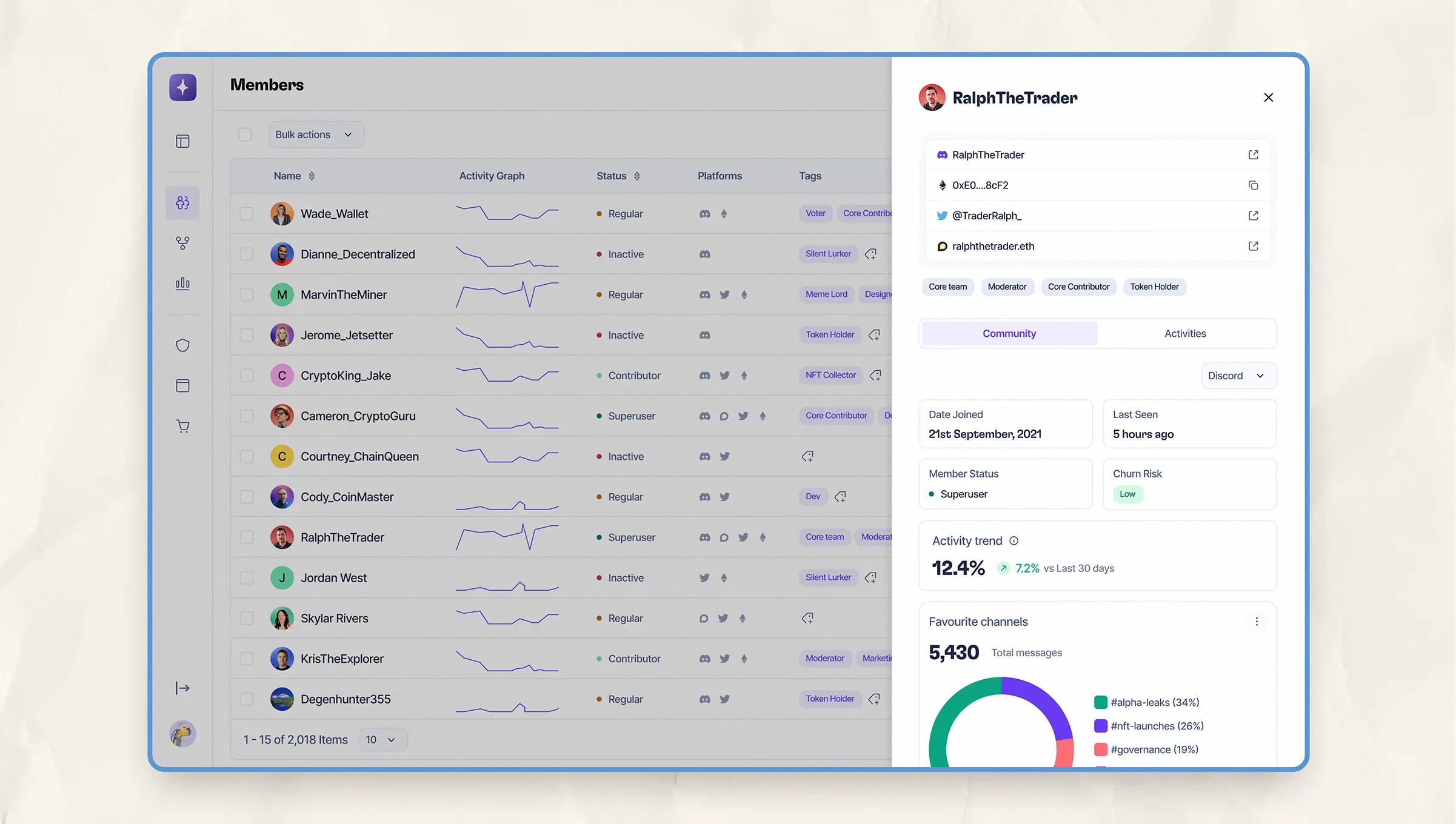
Expanded member view showing connected accounts, user status, risk level, and top activity trends.
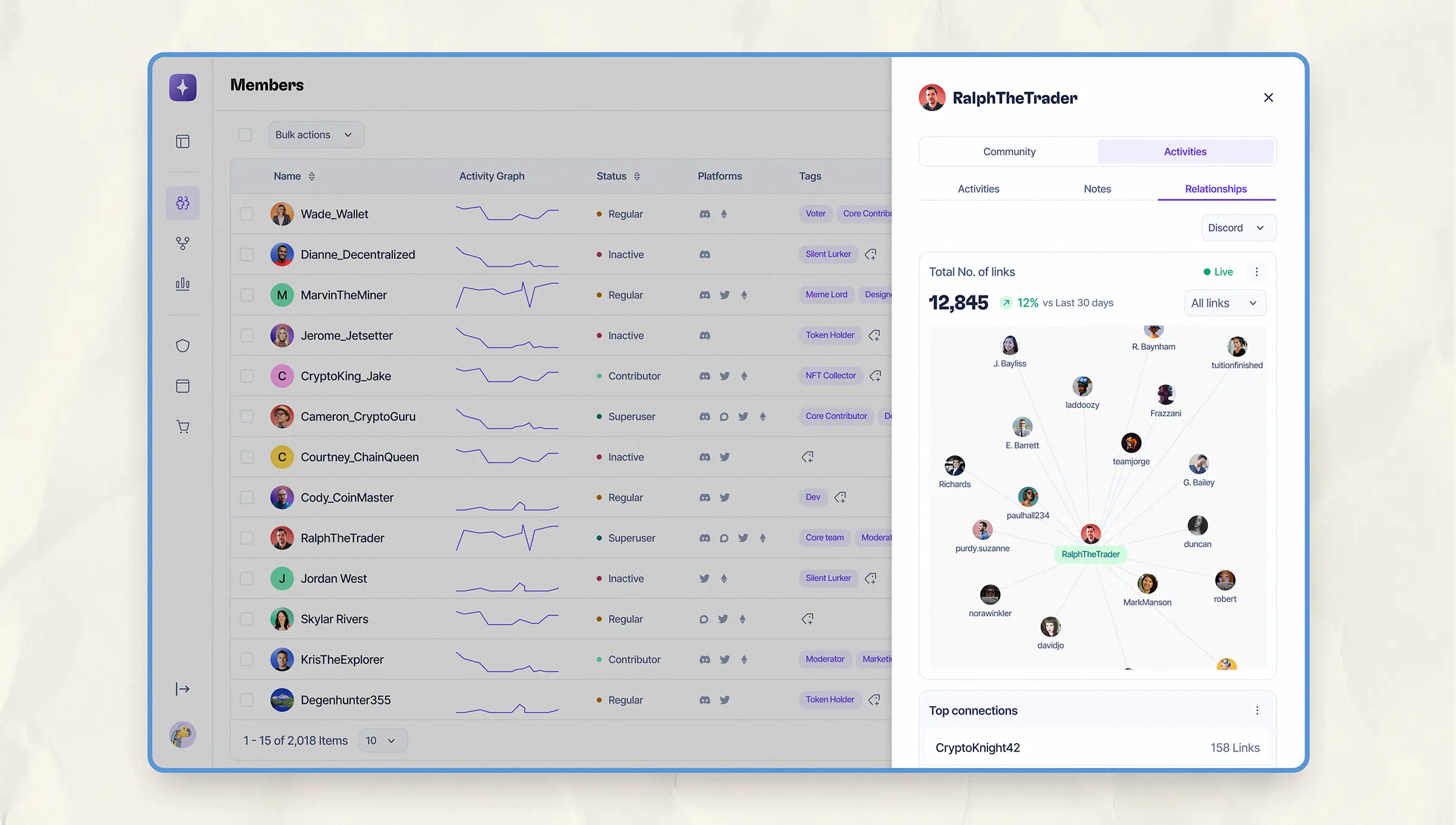
Relationship map for an individual member, making it easy to see their connections within the community.
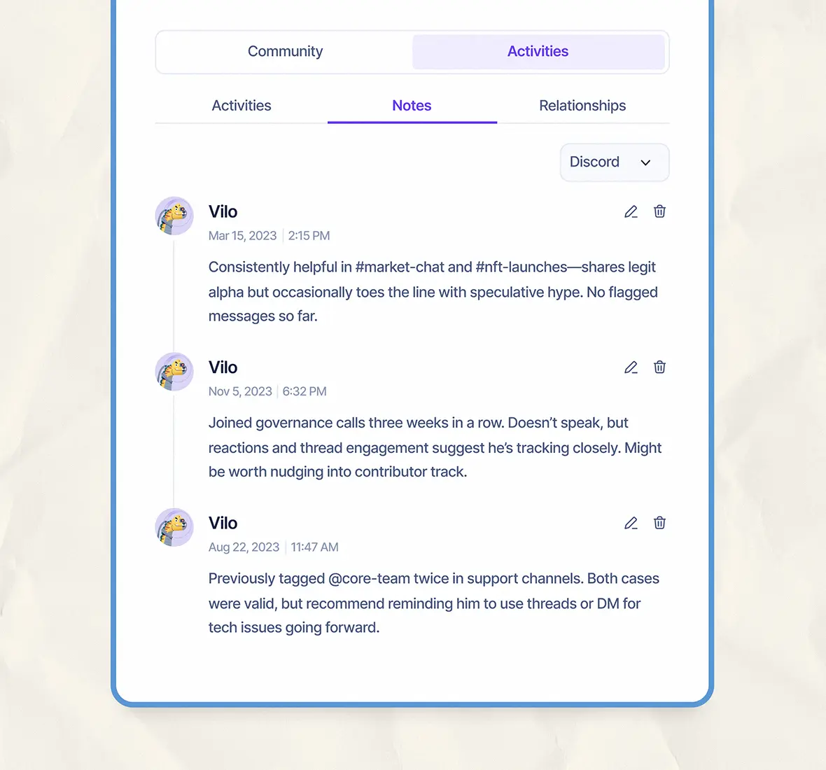
Private notes helped teams share context on member behavior and flag potential actions.
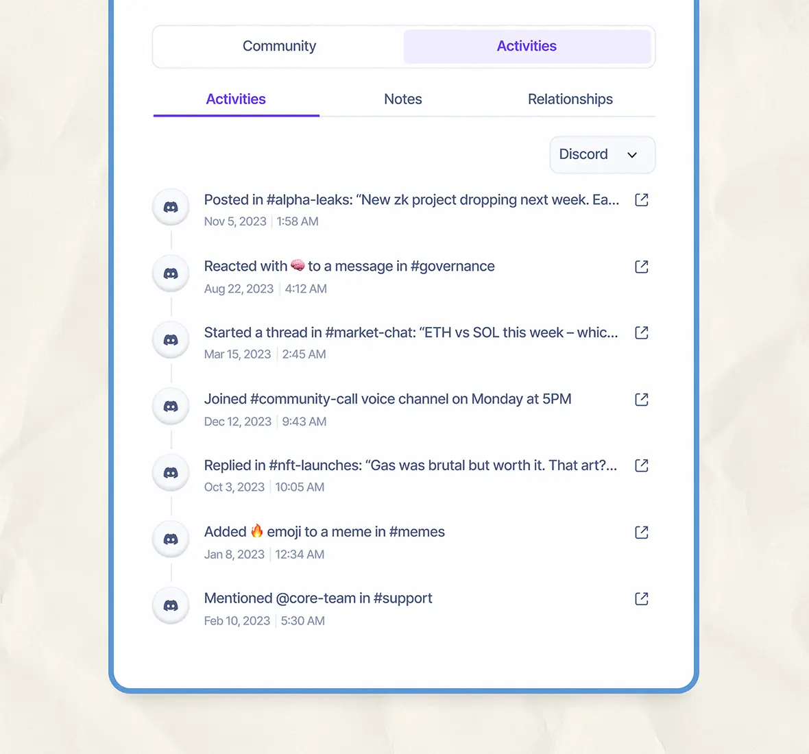
See a member’s full activity across Discord. This includes replies, reactions, and more, all in one timeline.
Conclusion
Mithril gave community managers clarity, not just data. By improving how teams scanned relationships and tracked engagement, we helped them cut down manual digging by 60% and make smarter decisions.
Curious to learn about my approach or how it could apply to your product? Let's chat!


© 2024 Felix Enyinnaya. All rights reserved
Of all the places you could be on the internet, you chose to stop by here. Thank you!