Designing for scale: creation of a design system for Mithril's product suite.
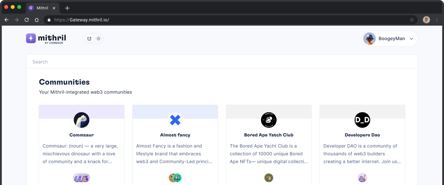
Commsor acquired Altr (renamed Mithril). A community analytics and deep insights tool. As a team, we were to expand Mithril to include Analytics, Gateway and Portal.
The task was to create a design system to maintain consistency in the product suite. This design system would also allow for future expansion and make designing new pages faster.
It is noteworthy that Commsor already had a strong brand and a style guide, which we were to build upon. My work involved creating components, defining breakpoints, tokens, and so on.
Impact
The creation of this design system led to a 20% increase in development speed, improved product consistency, and increased overall team productivity.
ROLE
Designer - Design system
timeline
Cole Zerr - Product Manager
Erik Rosemberg - Lead Engineer
Will Depue - Engineer
Dexter Molina - Engineer
Santi Arredondo- Engineer
Naren Gaurav - Community & BD
Principles guiding our system
Our design follows these principles to create a consistent and delightful experience for users and stakeholders.

future proof
The goal was to build a design system that could grow and evolve over time, adapting to the changing needs of the Mithril product. Hence the organizational structure of our design system.

Collaboration
This guarantees that the system meets the needs of the entire team and that the opinions of designers, developers, and other stakeholders are taken into account.

harmony
Consistency between design elements across the product suite was key to building trust. Harmony also ensures consistency between code and design.
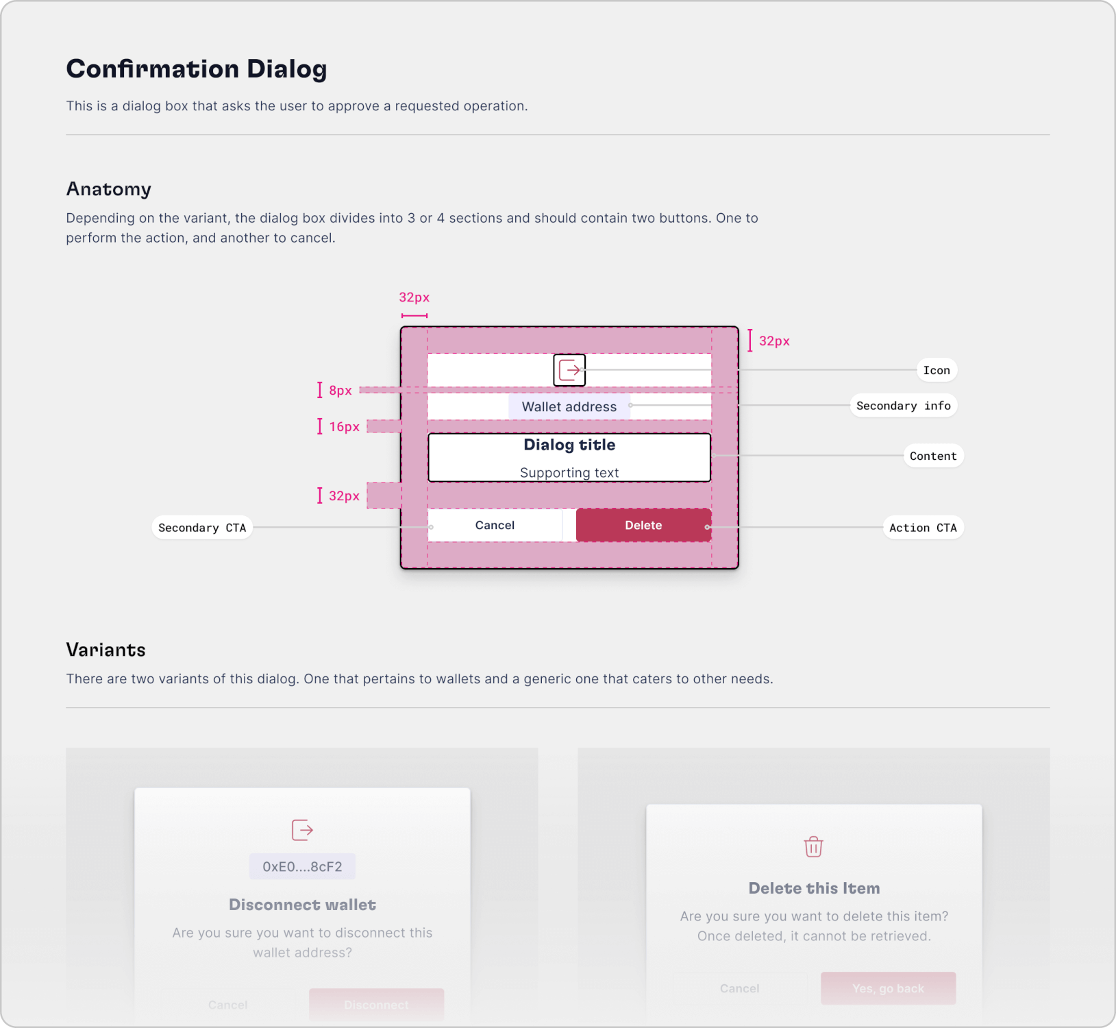
Organizing design elements: Core and product libraries for efficiency
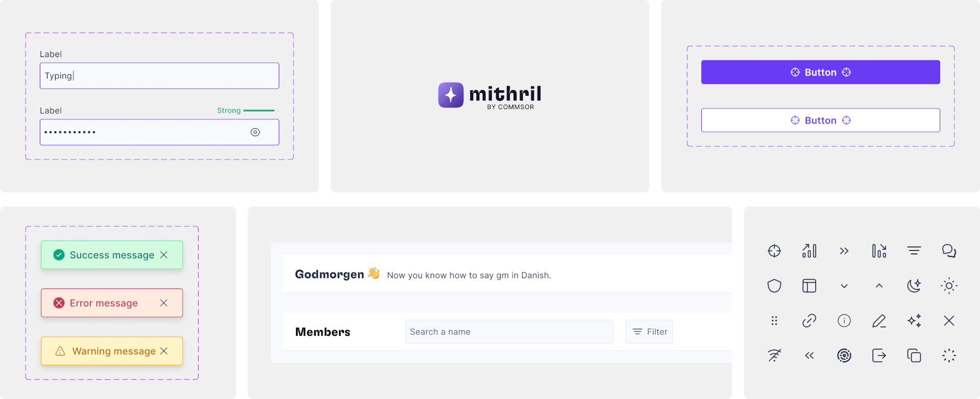
We split the design system into two parts. A core library and a product library. The core library stored shared components used across different product modules. These components included design atoms like buttons and pills, as well as higher-level elements like the side navigation and topbar. Product-specific libraries housed components that were specific to a product. This approach allowed for ease of maintenance and scalability.
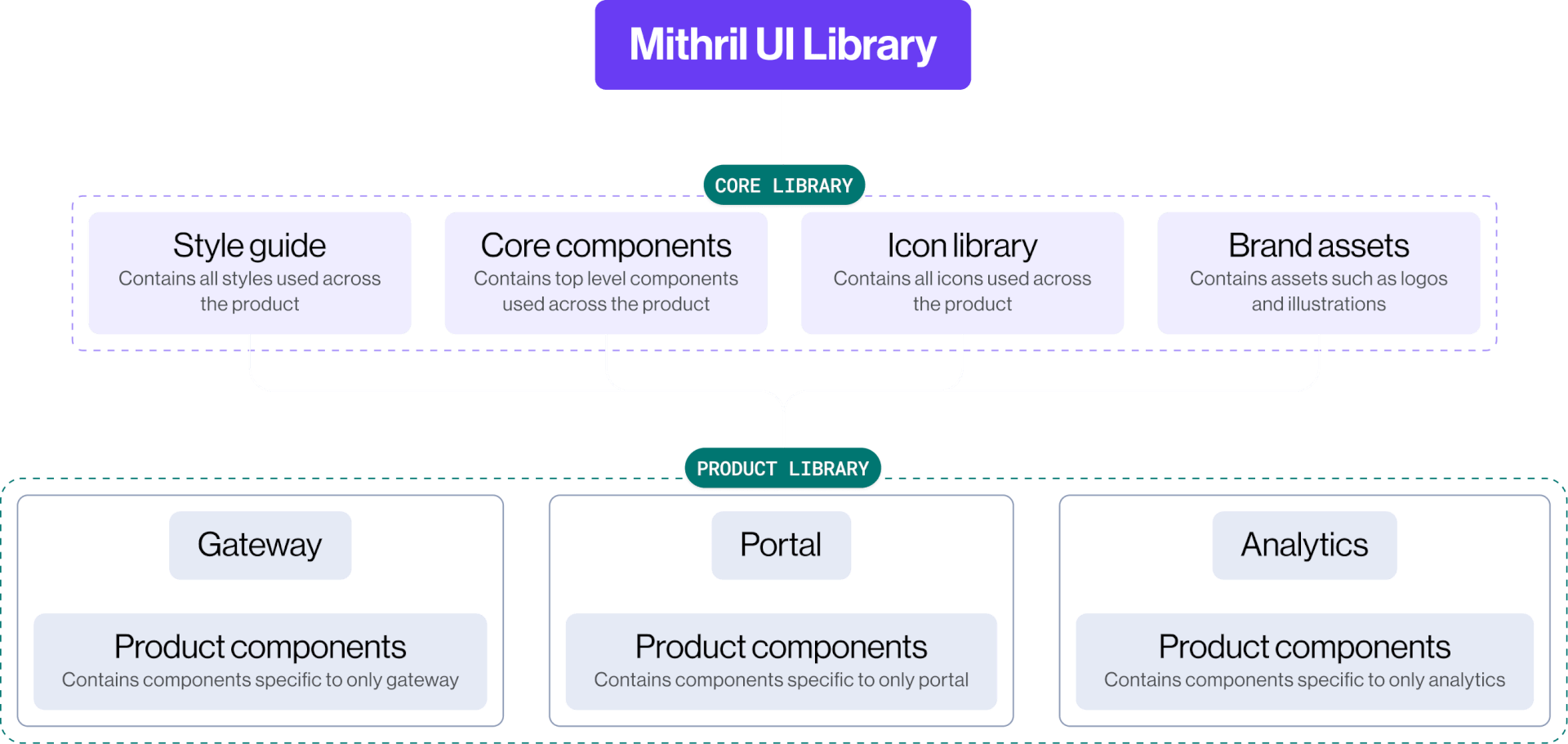
Mithril design system organizational chart
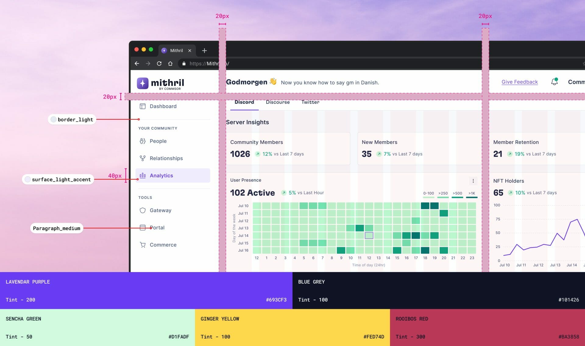
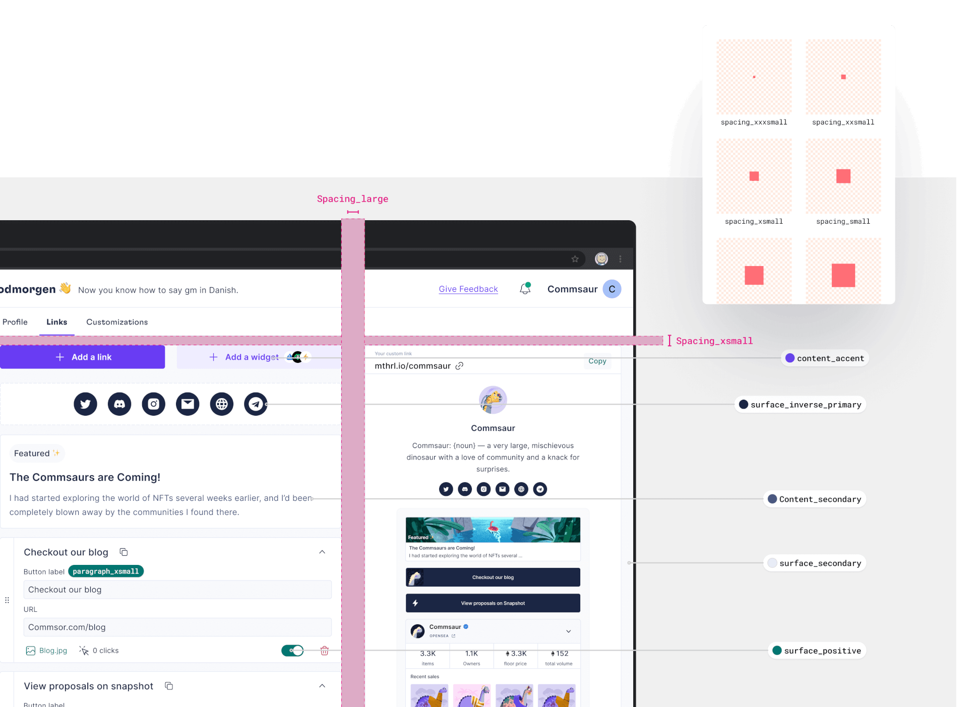
Storing design decisions using tokens: Color, Type, and more
Design tokens make UI elements easy to manage and update. Our tokens included color, type, spacing, corner radius, and shadows.
To make our color tokens easier to manage, we divided them into core colors (Hex values), option tokens, and decision tokens. We didn't include the component level.
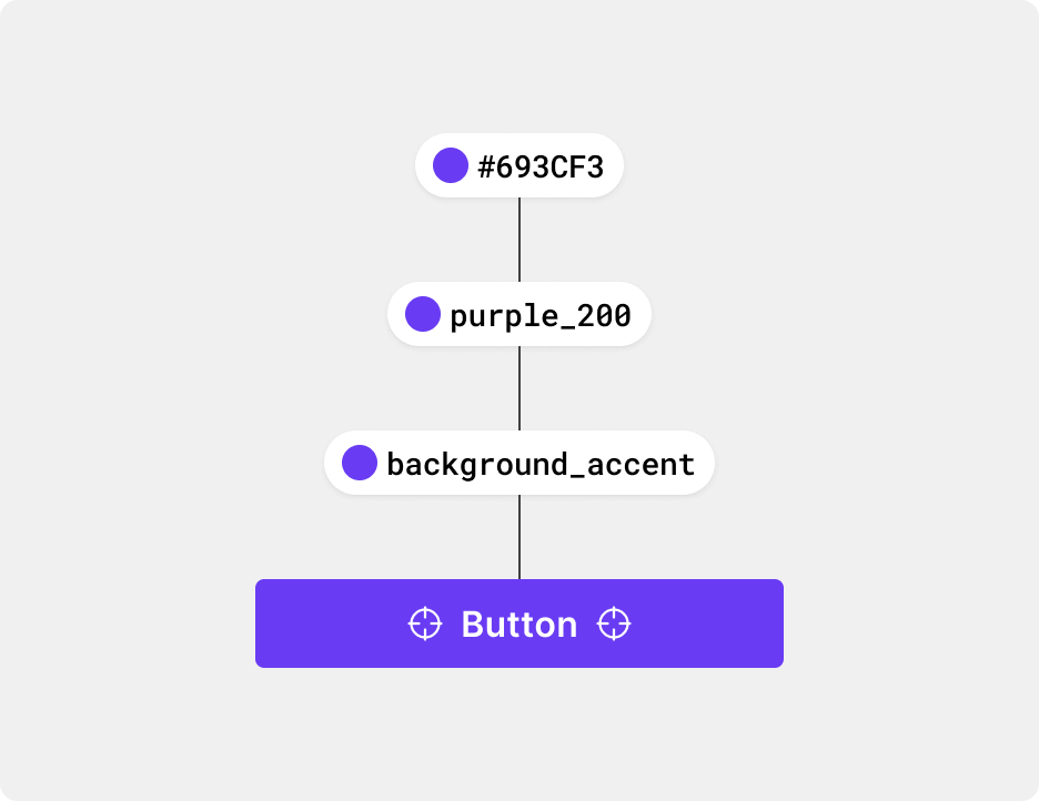
We used the Uber base design system as inspiration to guide our decision tokens. These tokens viewed UI elements in terms of surface/background, content, and borders.
Grids & Breakpoints: Adapting with a 12-column grid and collapsible navbar
Adopting a 12-column grid, the navbar had a fixed width of 248px. The content area stretches up to a maximum width of 1440px. When your screen is smaller than 1280px, the navbar collapses and gives more space to the content. During this project, we did not consider mobile screens.
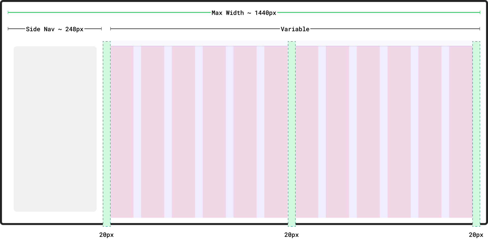
Grid anatomy
Simulating reponsiveness
Design documentation: How they're built and used
Our documentation defined the components and design elements. We considered the component's structure, properties, usage rules, and behavior.
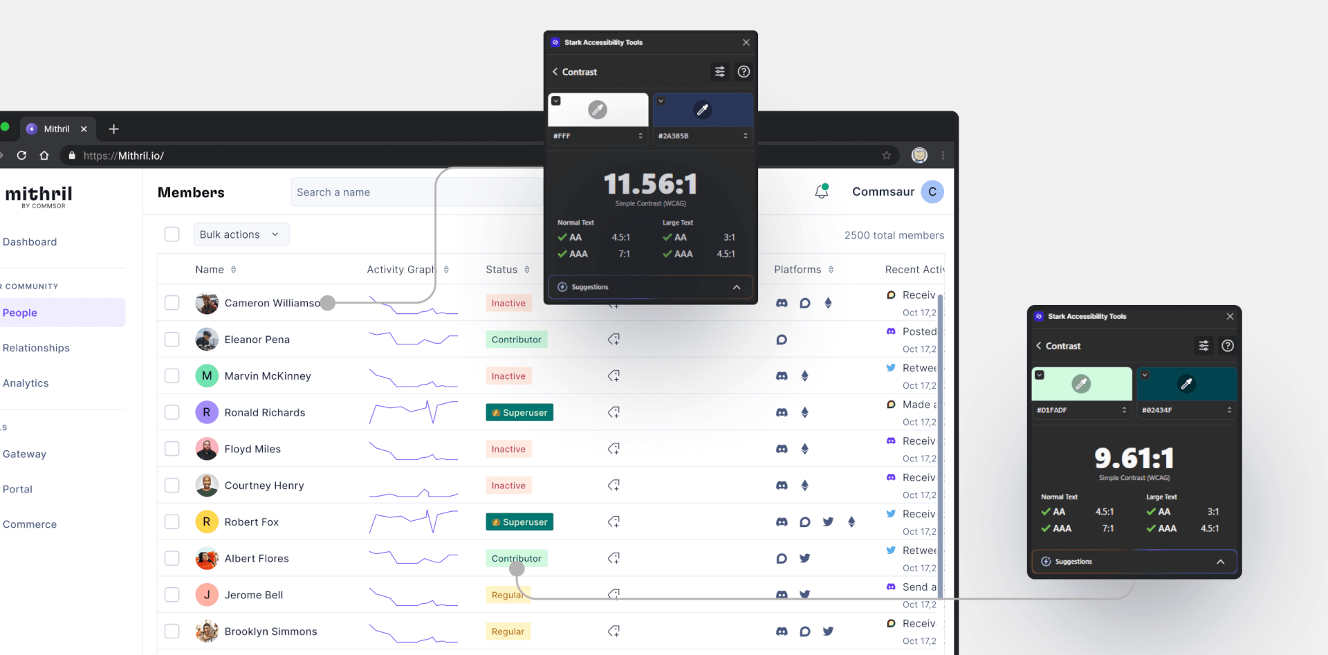
Inclusive Design: How we make sure It works for all
When accessibility is a priority, a product can provide a user experience that includes more people. For color contrast, we aimed for a contrast ratio of at least 4:5:1 for normal text and 3:1 for large text. We also considered our tech stack to ensure compatibility with assistive technologies.
Learnings
1. Design systems are always a work in progress, so long as the product keeps changing. We still have a lot of work to do to make the Mithril design system standard, as there are gaps in our documentation, non-inclusion of content guidelines, governance, and so on.
2. Besides color contrast, you can make your SaaS web application more accessible by adding keyboard shortcuts.